ELEDA is a London-based duo creating music and immersive experiences designed to inspire, empower, and invigorate.
Their diverse backgrounds and passion for cutting-edge technology shape a sound and vision that is simultaneously cinematic and ethereal, bold and elegant.
Art Direction Corporate Design Photography Campaign Design
THEMES
Cinematography Boldness Eccentricity Ethereality
They came to me without an existing brand identity. Through my Brand Blueprint coaching programme we first defined the strategic and conceptual groundwork (their values, tone of voice, and brand personality) before we translated that foundation into a visual language.
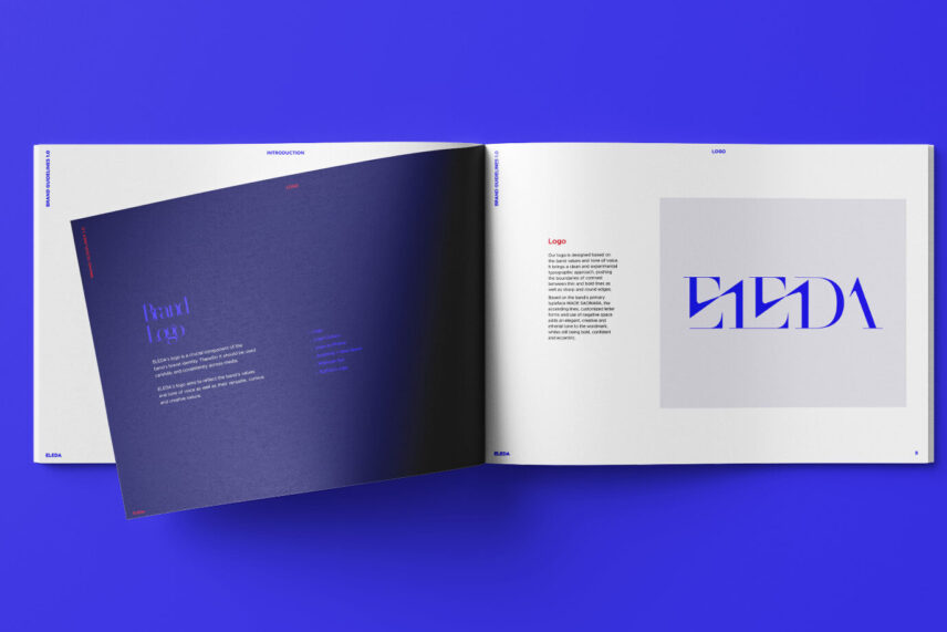
Logo
The ELEDA logo pushes the boundaries of contrast — thin and bold lines, sharp and round edges — creating a mark that is simultaneously bold and ethereal, confident and eccentric. Built on MADE SAONARA, customised letterforms, ascending lines, and deliberate negative space add elegance and a sense of the ethereal to the wordmark.
Early Drafts:
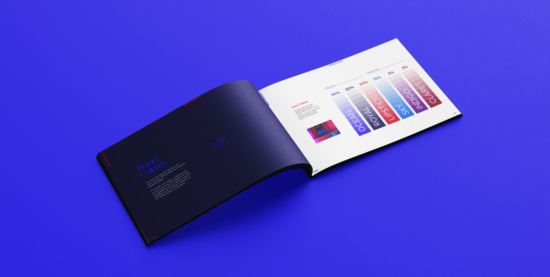
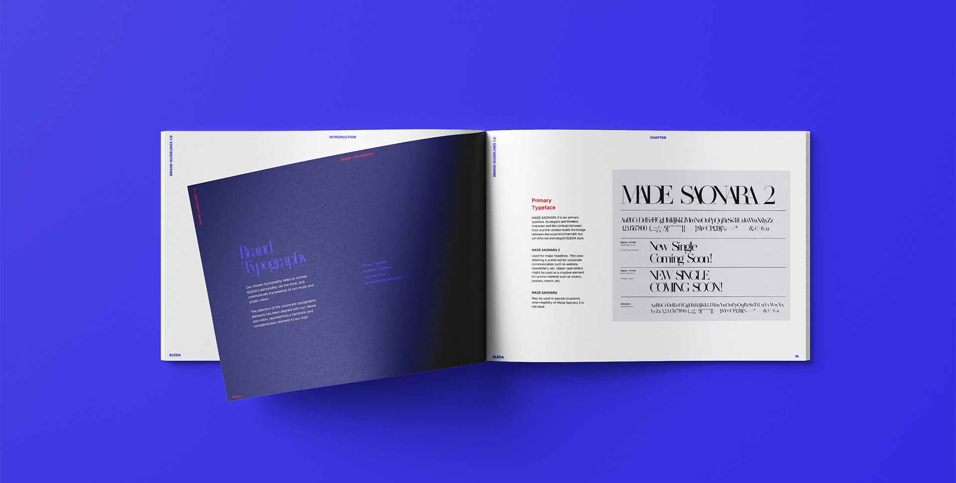
Color Palette + Typographic System
Inspired by cinematography and rooted in colour theory, the palette reflects ELEDA’s sonic diversity — bold and dramatic on one end, ethereal and delicate on the other.
MADE Saonara’s sharp editorial drama meets Metropolis’s clean geometric precision — a typographic pairing that bridges ELEDA’s contrasting worlds of boldness and ethereal elegance.
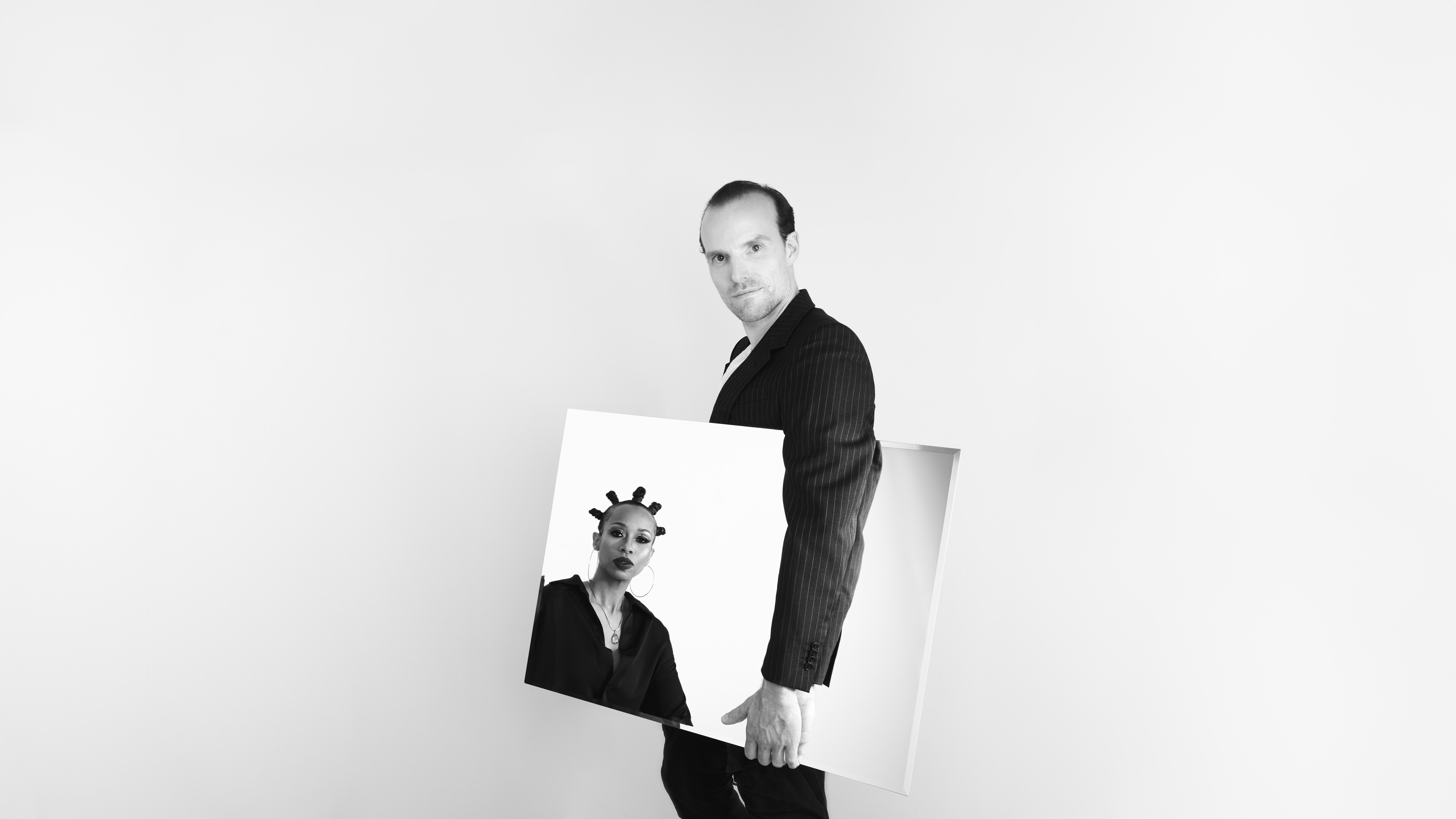
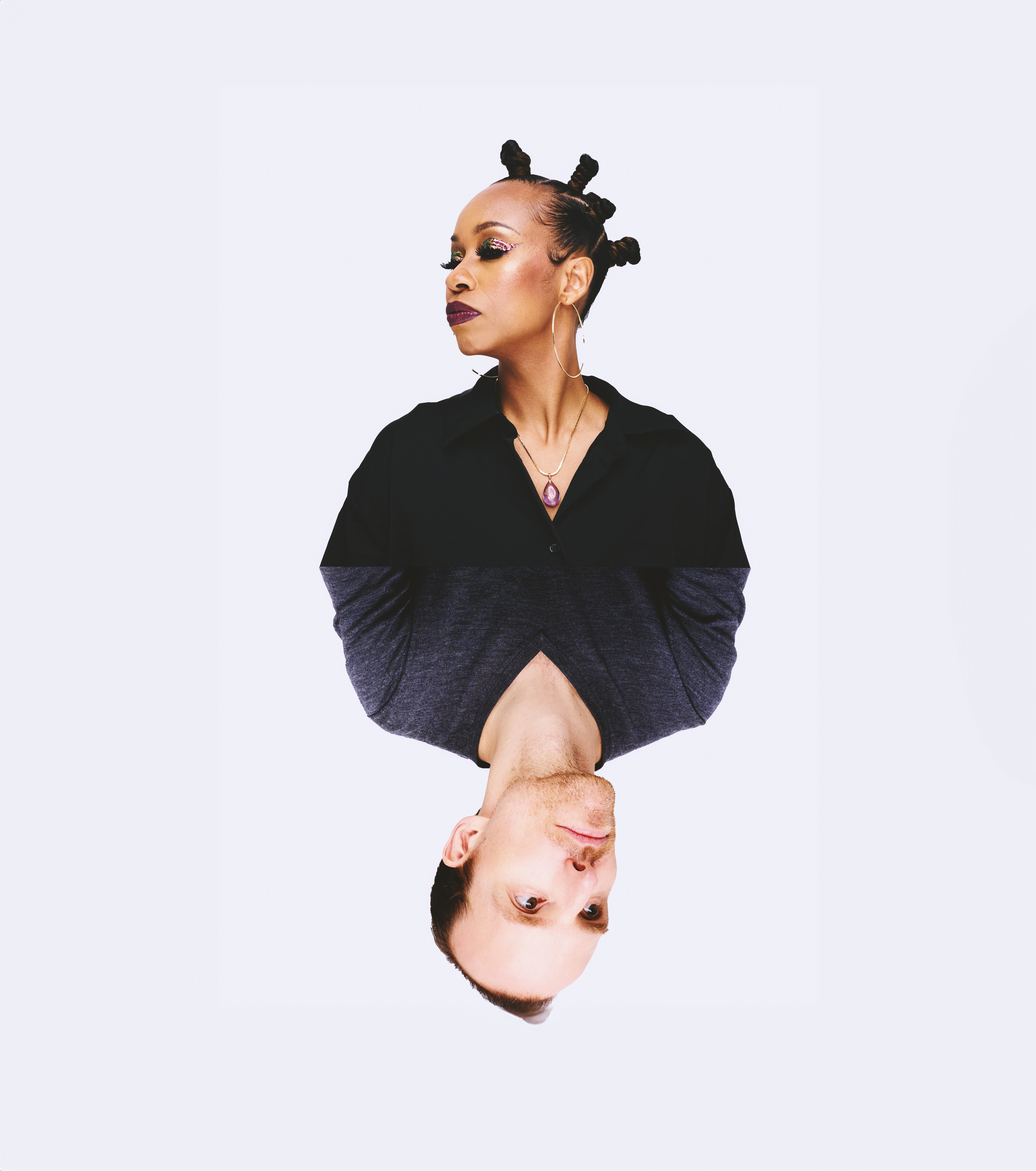
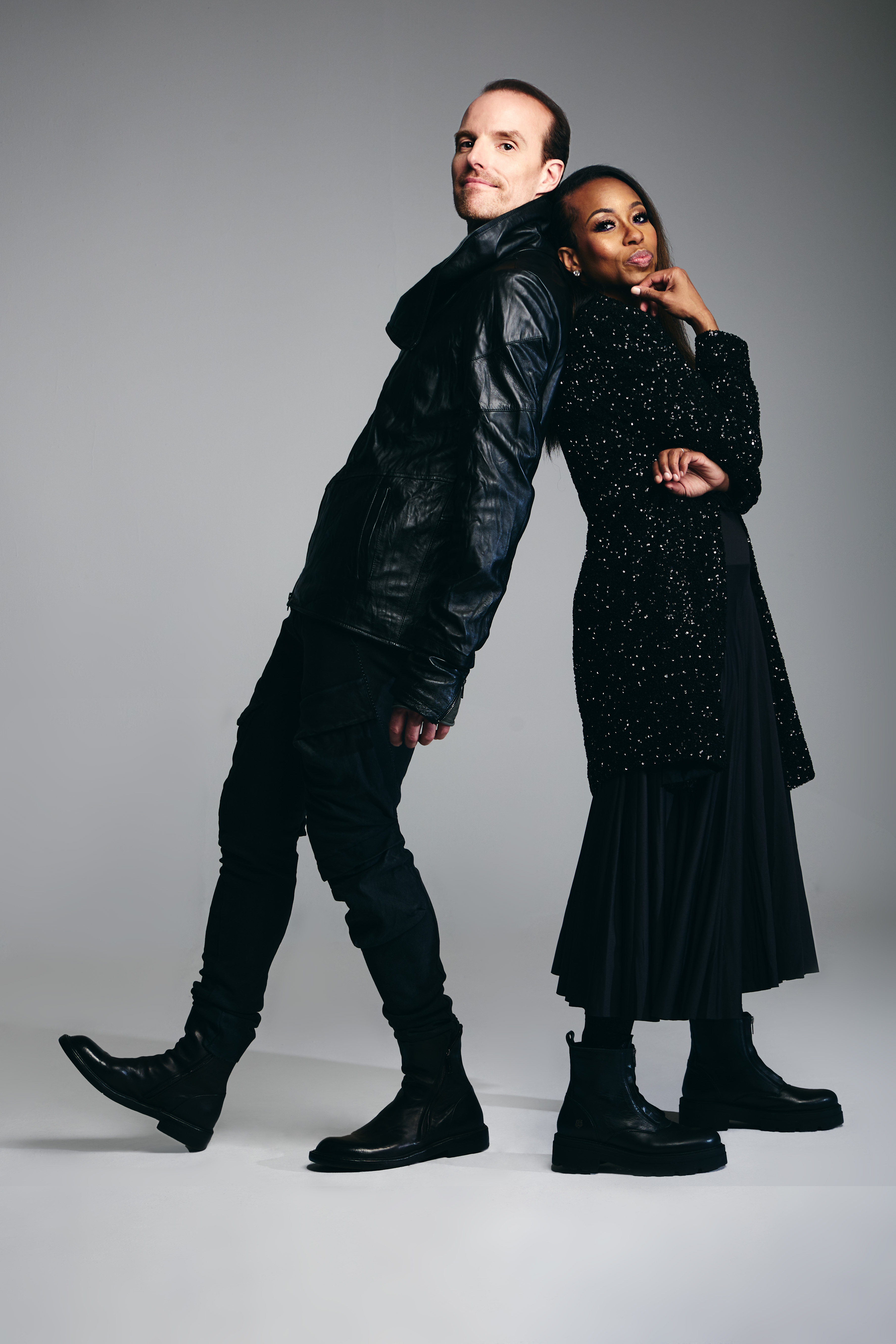
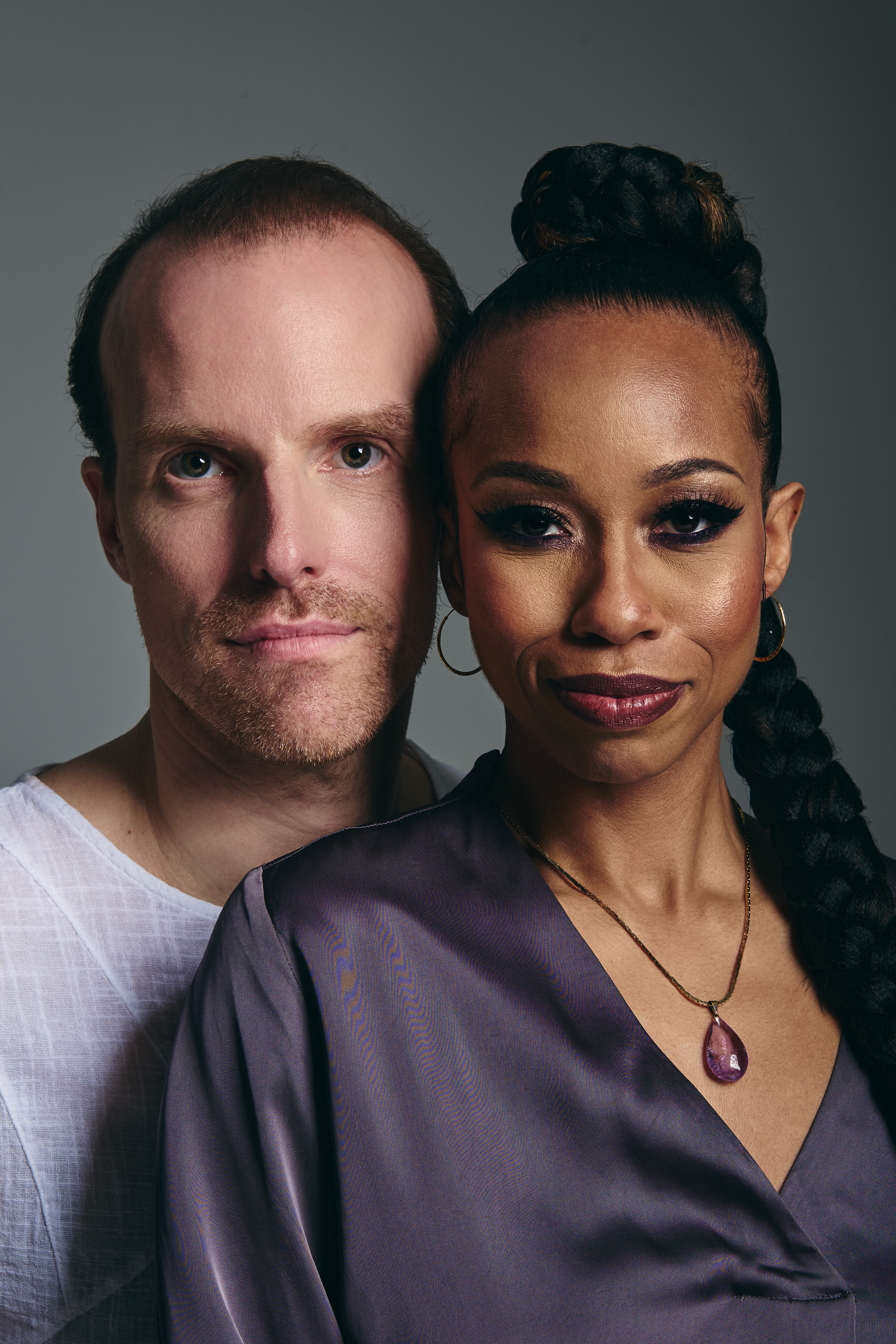
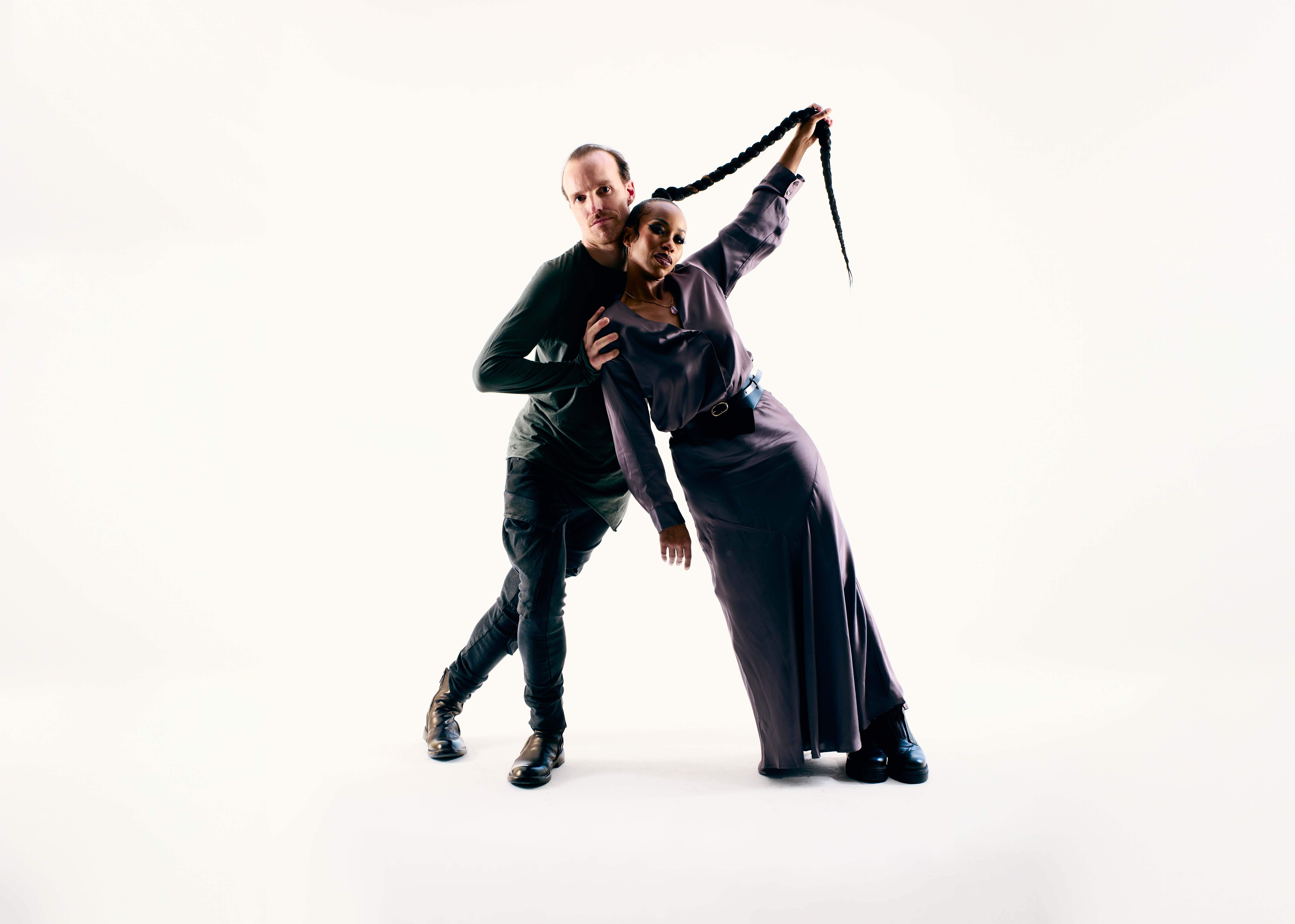
Press shots translate this duality into imagery—clean yet expressive, using negative space, experimental props, and curated styling to capture their unique voice.
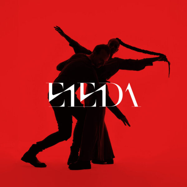
Alpha EP Release
Design of cover artwork and social media assets for the release campaign of the debut EP Alpha.
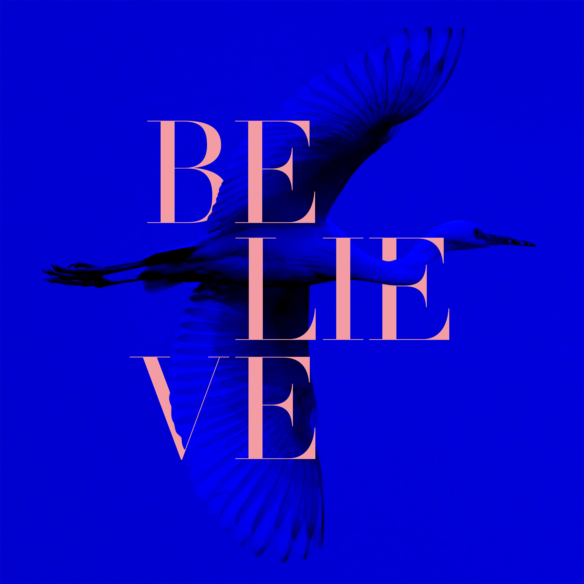
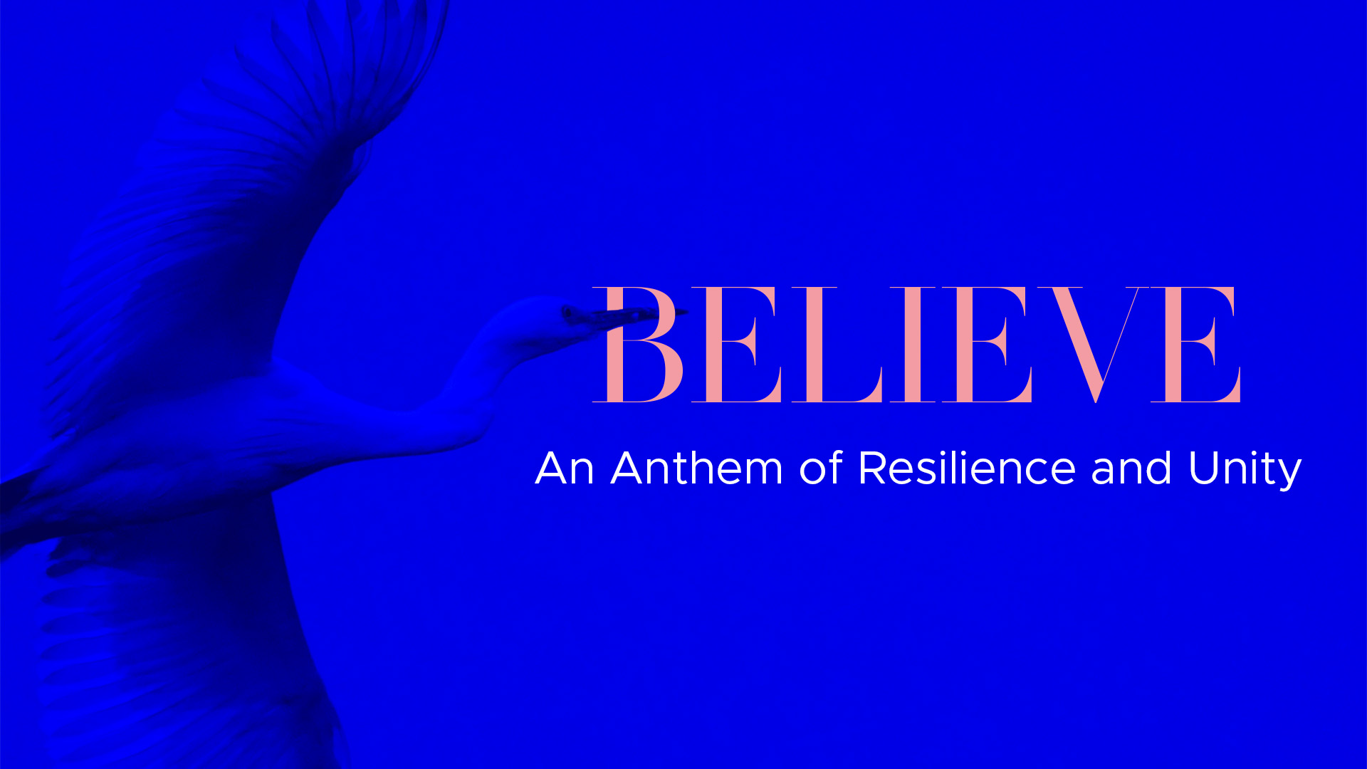
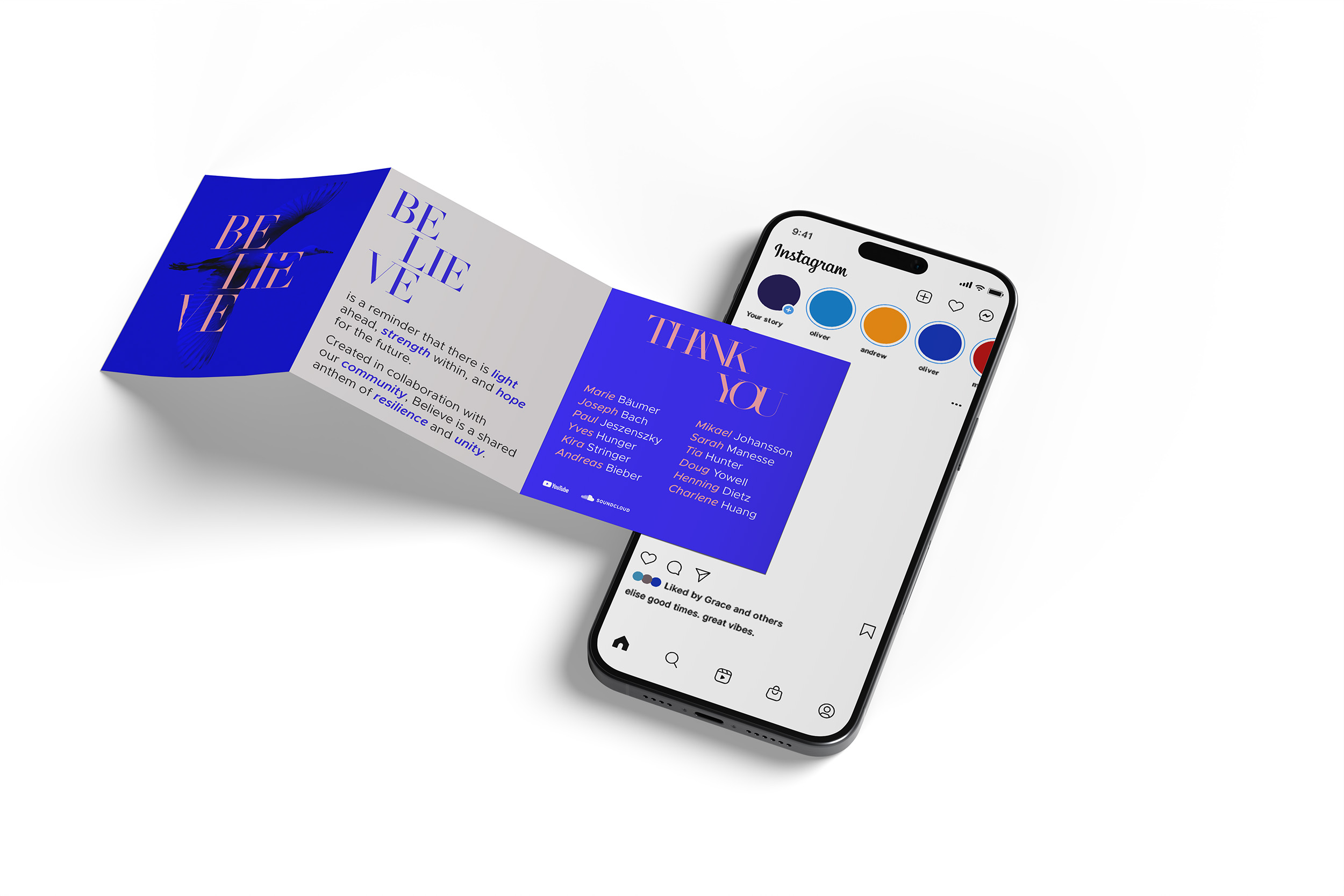
Believe Single Release
Design of cover artwork and social media assets for the release campaign of the single Believe.
Grammy Awards Submission
Grammy Awards submission print ad for Billboard Magazine (edition October 4th, 2025)
heartfelt management
I crafted an elegant brand identity for Heartfelt Management, an artist management agency founded on empathy, connection, and collaboration, dedicated to helping artists realize their visions.
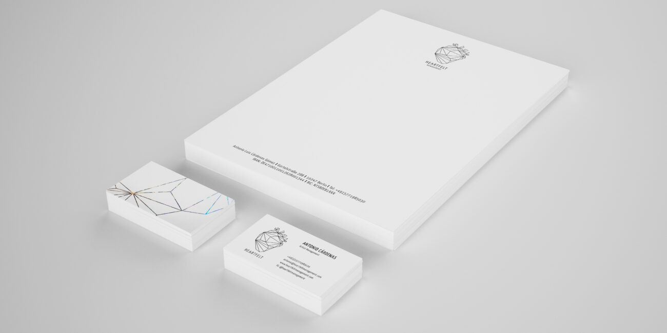
My scope included logo design and animation, selection of a corporate color palette and typography, as well as the core stationery. The visual system balances clean refinement with meaningful symbolism,centered on an abstract heart logo.
Art direction Corporate Design Print + Motion Design
THEMES
Empathy Connection + Collaboration Respect Vision
Logo
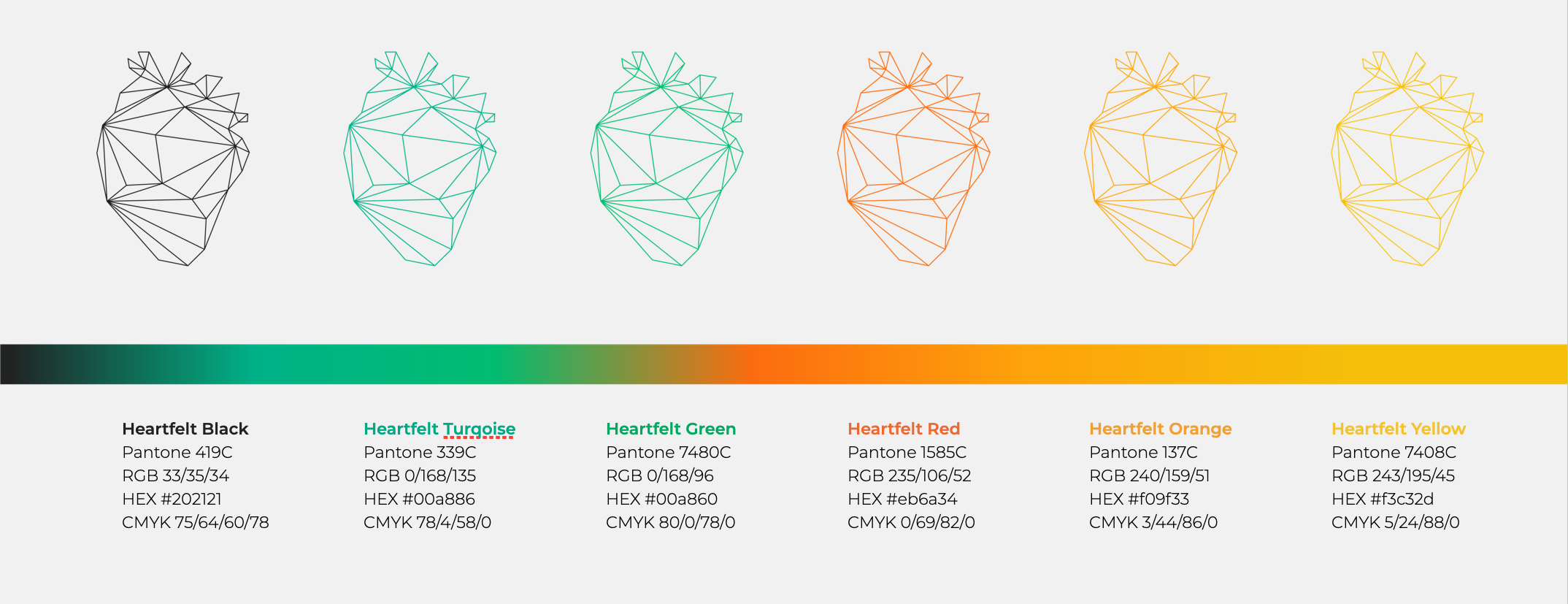
Interconnecting lines converge into a subtle heart, representing connection, collaboration, and empathy at its core.
Color Palette + Stationery
A sophisticated rainbow palette reflects the agency’s core values of diversity and inclusion.
Green grounds the palette with a sense of growth and harmony, while warm tones bring the passion and human warmth that define Heartfelt’s approach to artist management.
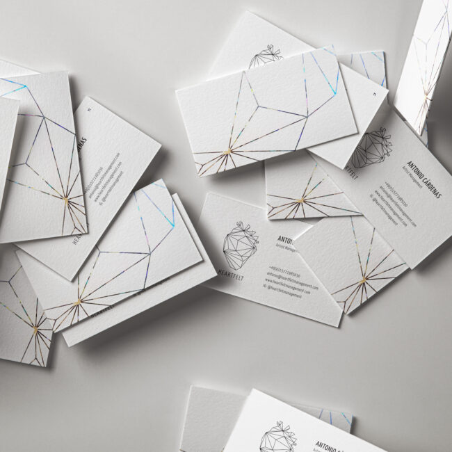
Stationery
Business cards with holographic foil printing add a modern luminous, welcoming detail.
NOSOYO
NOSOYO came to me at a turning point — having evolved musically and personally, their existing identity no longer reflected who they had become.
Through my Brand Blueprint coaching program we defined their new brand voice together, establishing a tone that is energetic, kind, honest, and playful, before translating it into a complete visual identity.
CLIENT
NOSOYO
SCOPE
Art Direction Corporate Design Photography Campaign Design Print + Motion Design
THEMES
Energy Kindness Honesty Playfulness
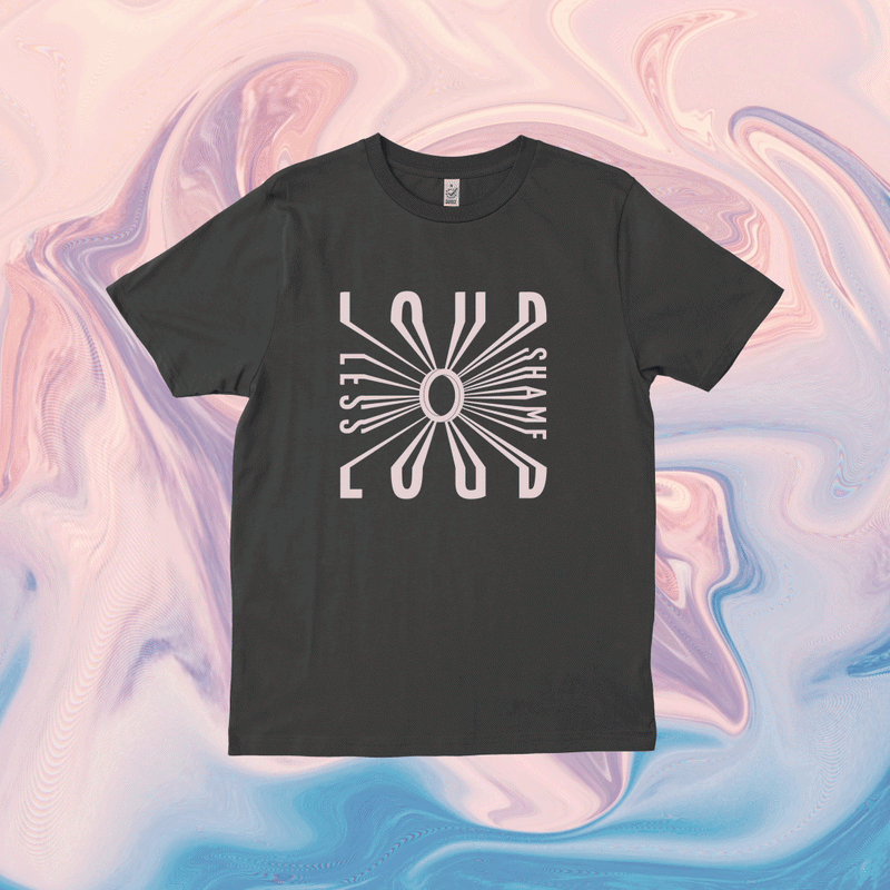
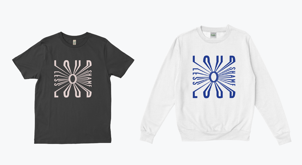
The rebranding encompassed logo, colour palette, typography, merchandise, and campaign assets, launching alongside their album Loud And Shameless.
Logo
The logo merges serif and sans-serif letterforms — bold black letters alongside light, outlined ones — expressing the duo’s honest yet playful contrast. Dynamic yellow 3D “O” letters and rounded forms energise the mark and emphasise collaboration.
Color Palette + Typographic System
Through strategic use of color psychology and harmony, the individual brand colors and overall palette are designed to reflect the band’s core values and tone of voice. Featuring a diverse range of vibrant hues, the palette highlights the band’s energetic and playful personality.
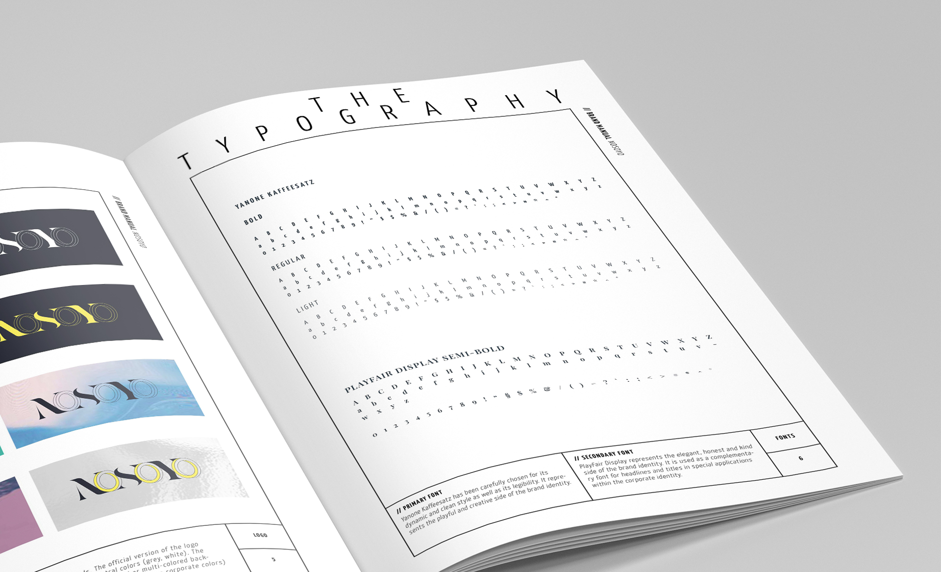
A pairing of contrasts — Playfair Display’s editorial elegance and high-contrast serifs meet Yanone Kaffeesatz’s condensed geometric energy, mirroring the band’s own duality: graceful yet playful, bold yet warm.
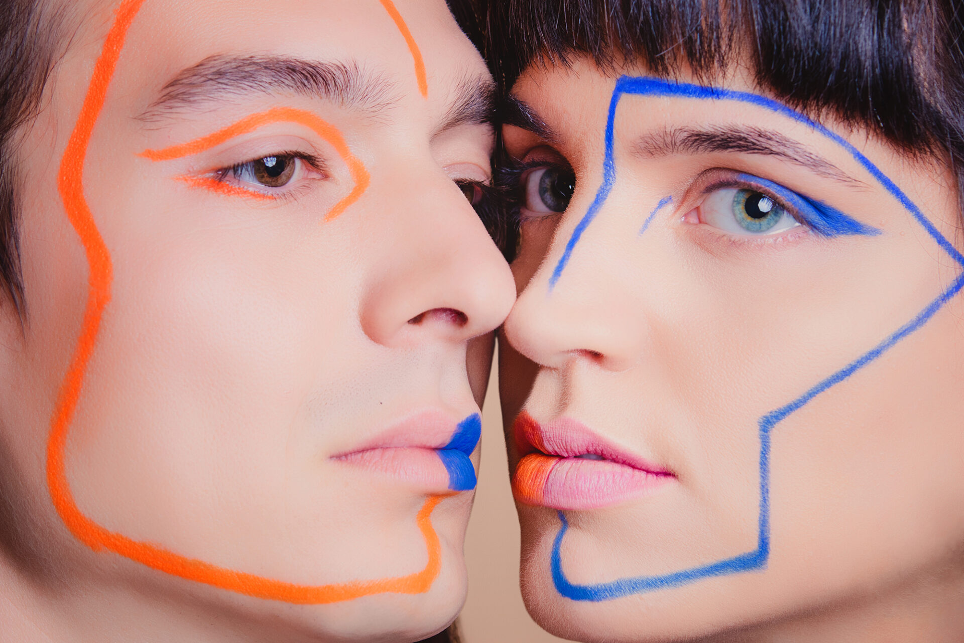
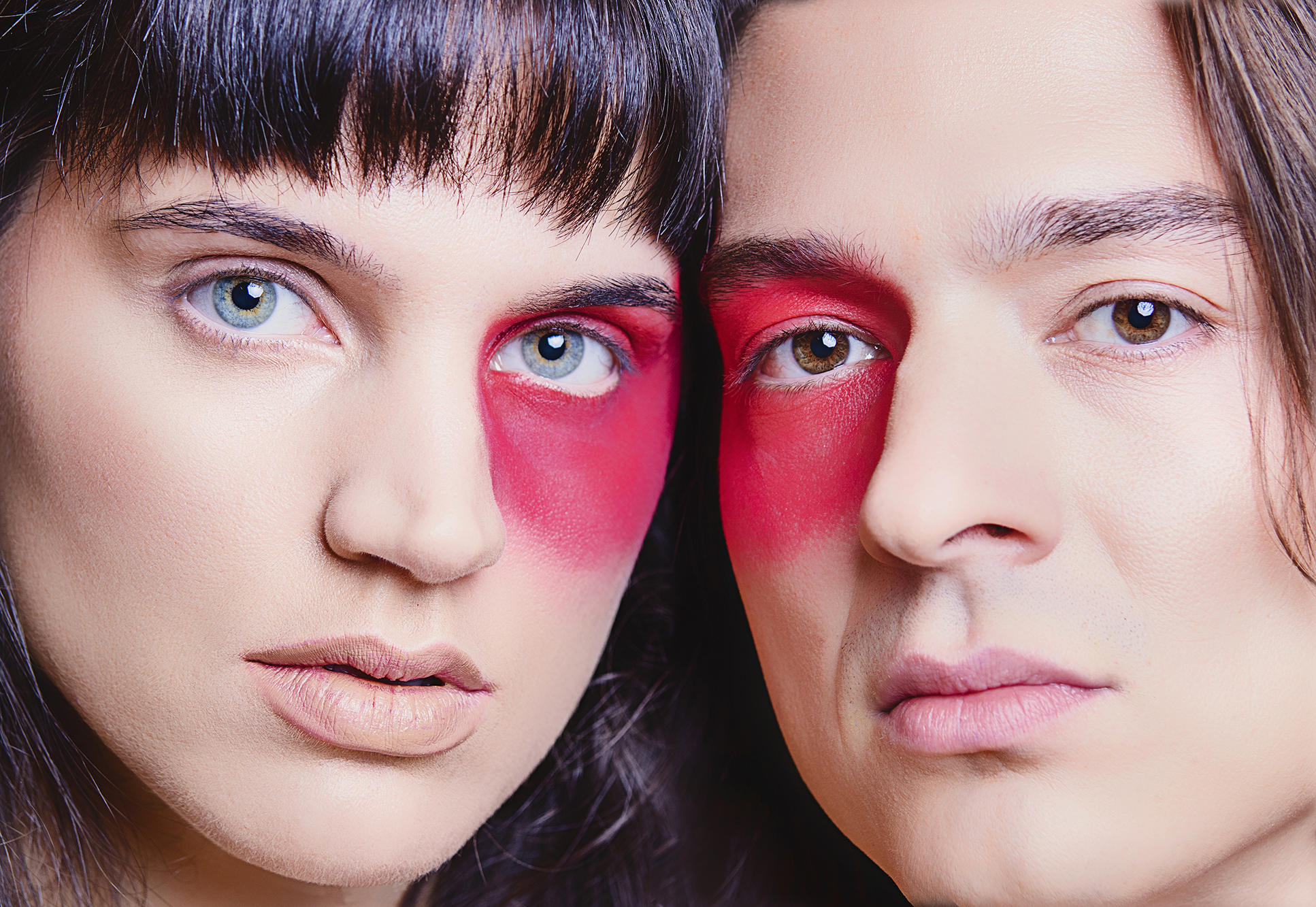
High-key lighting and soft warmth set the tone — kind and approachable. Close-up framing with bare shoulders brings an honesty and intimacy that pulls the viewer in. Eccentric, colourful make-up injects the playfulness and energy that define the band’s personality. Every visual decision maps directly back to NOSOYO’s brand voice.
Loud & Shameless Album Release Campaign
The campaign assets bring the new identity to life across every touchpoint — album cover, two single covers, two lyric videos, animated social media posts, and merchandise.
Bold typography paired with intimate photography captures the band’s energetic yet kind tone of voice, while brand colours and typefaces carry the system consistently across formats.
Lyric Videos + Animated Posts:
Kinetic type paired with video footage extends the visual language into lyric videos and social media animations.
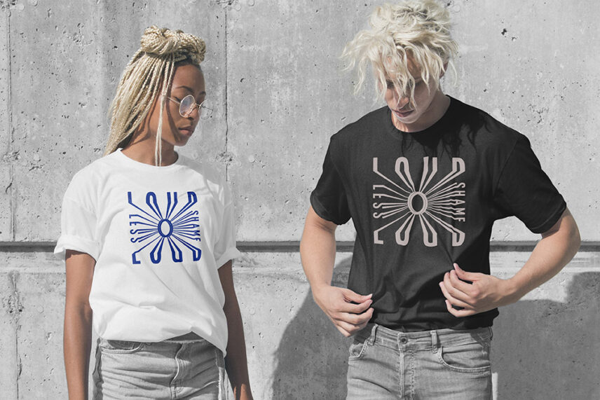
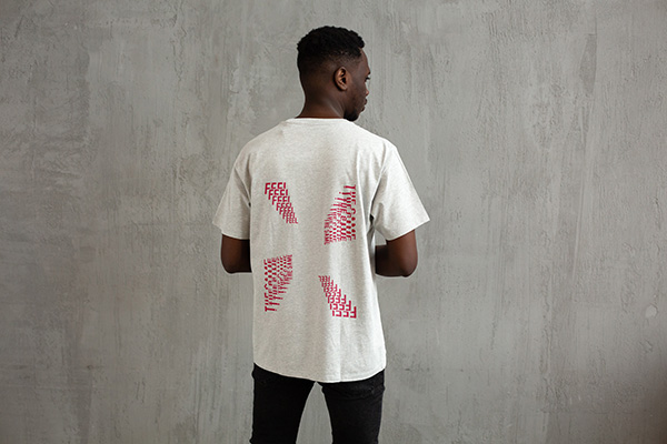
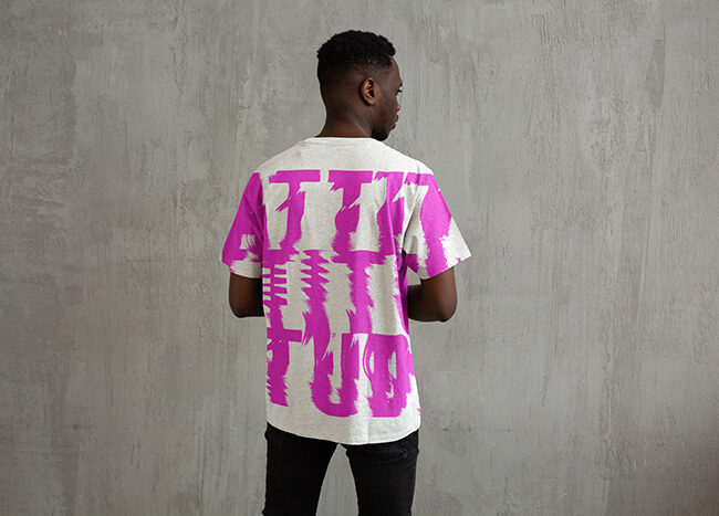
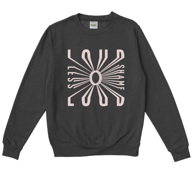
Merch:
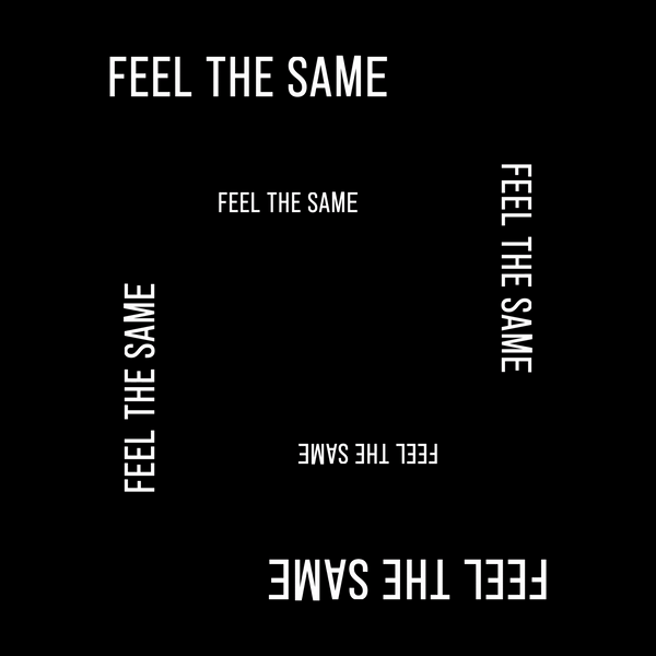
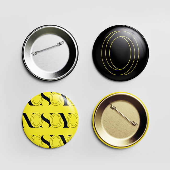
Merchandise extending the visual identity across T-shirts, sweatshirts, and pins — each piece carrying the bold typography and vibrant colour palette of the new brand.
The Attitude and Feel the Same designs, though not produced, demonstrate the full range of the identity system in a physical format.
INK ELEMENT
INK ELEMENT is a Hong Kong-based DJ and electronic music producer whose work explores the dualism between who we are and who we want to be — using music as a safe space for reflection and self-discovery.
The visual identity translates this concept into form. The core logo was created using kinetic scanography — an analog technique that produces organic, chaotic distortion as a direct metaphor for the gap between expression and perception.
CLIENT
INK ELEMENT
SCOPE
Art Direction Corporate Design
THEMES
(Mis-)communication Dualism Authenticity
Logo
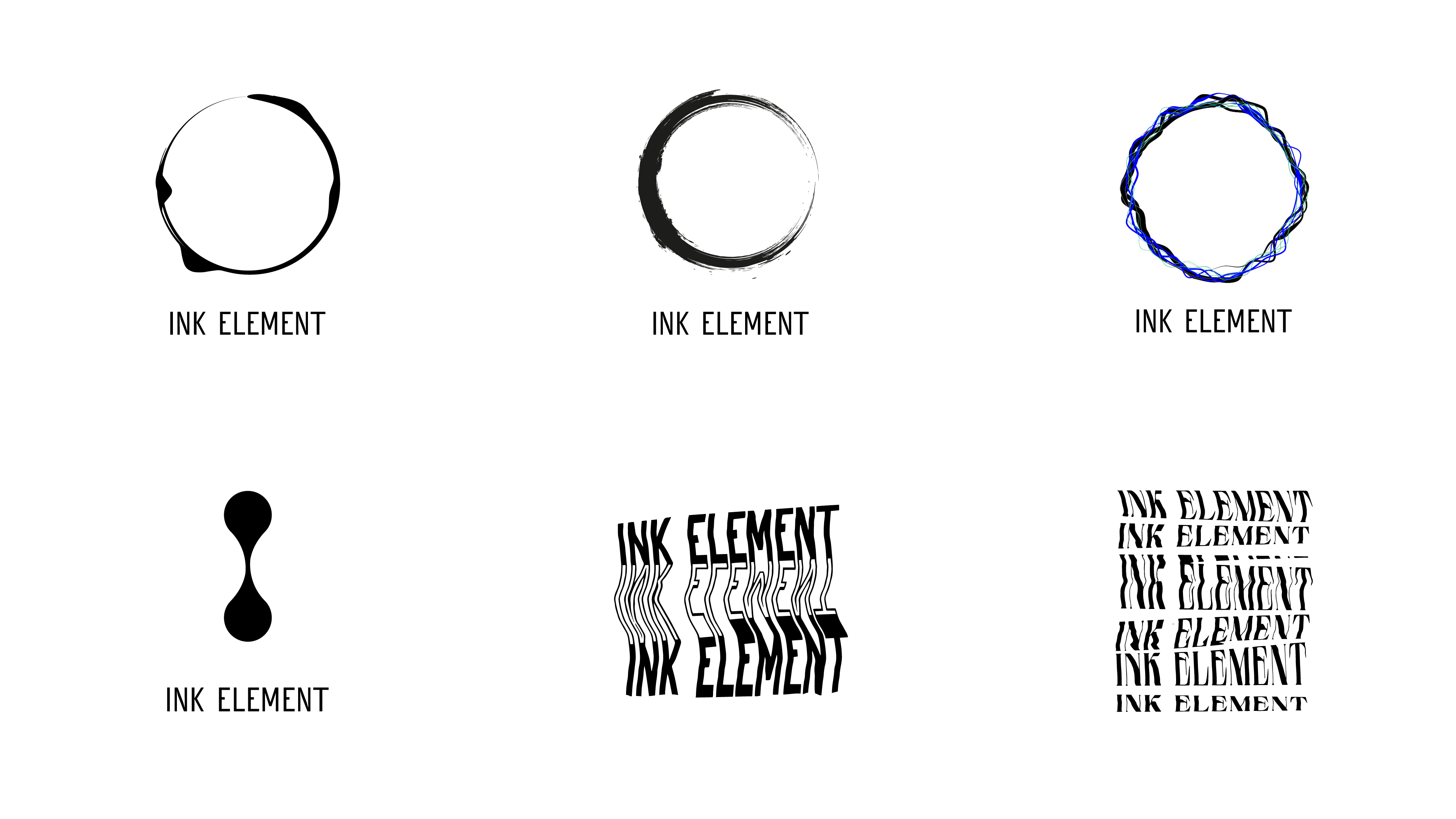
Inspired by Denis Villeneuve’s Arrival, early explorations experimented with watercolour, Rorschach folds, and kinetic scanography. The scanography technique became the final mark — organic distortion deliberately contained within a clean geometric square, representing the clarity that can emerge from introspection.
Early Drafts
Early logo drafts drew inspiration from Denis Villeneuve’s Arrival—a film about the transformative power of language and communication. To keep the human hand visible in the process, I experimented with analog techniques: watercolor, Rorschach folds, and kinetic scanography. The distortion technique also served as a visual metaphor for miscommunication, capturing the gap between expression and perception. The process became part of the concept.
Color Palette + Typographic System
The brand typography, color palette, and overall system reinforce the artist’s values of creativity and authenticity, creating a bold and coherent brand that invites reflection.
Voca’s high-contrast brutalist serifs bring bold, expressive elegance. Devanesa counters with semi-condensed neo-grotesk precision — its origins in stone engravings from a small Spanish village quietly echoing the brand’s exploration of human mark-making and authentic expression.