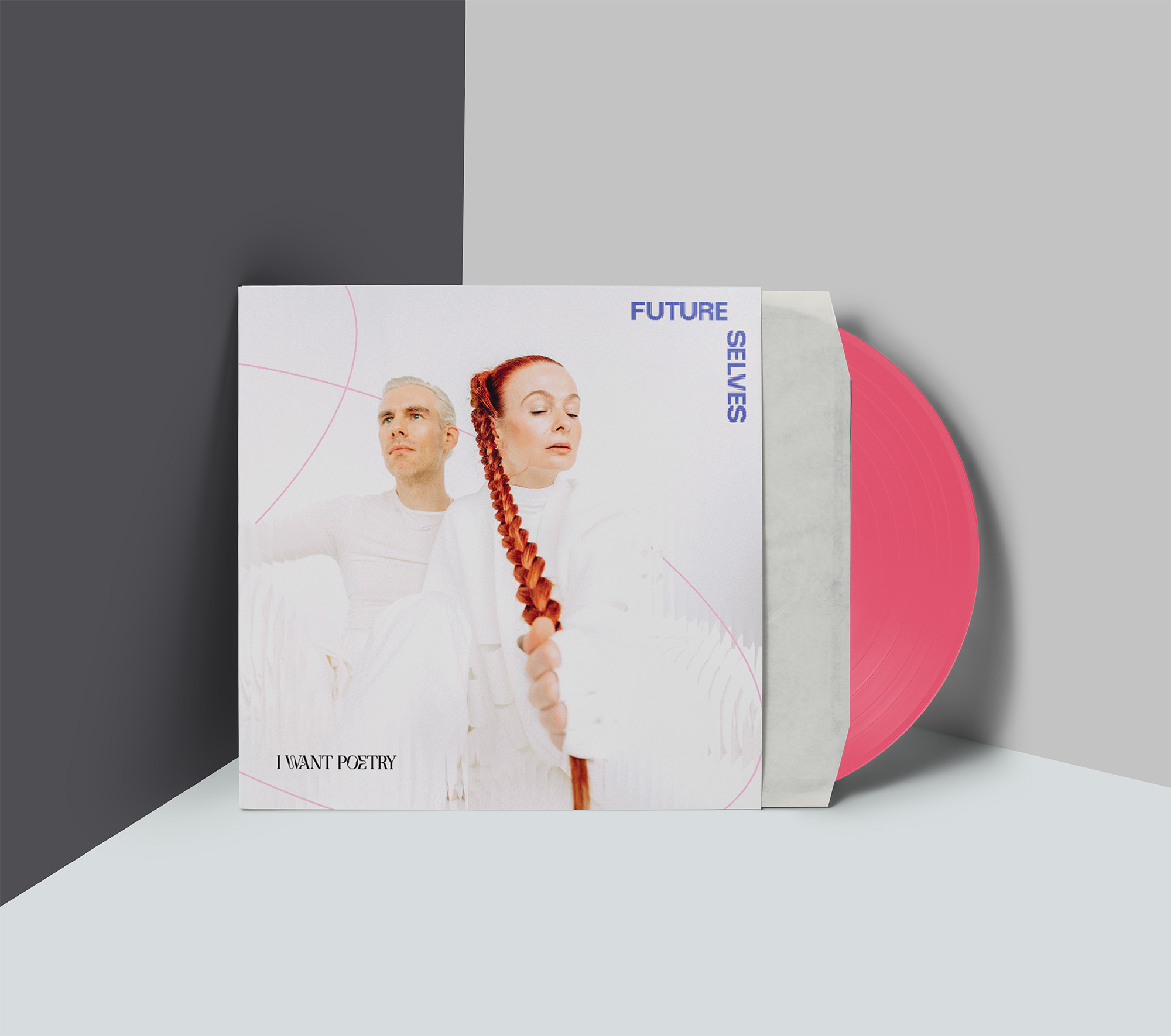
I WANT POETRY is a Dresden-based duo making music at the intersection of indie pop and electronic production. With their album Future Selveson the horizon, they came to this project at a turning point — ready to build a visual identity that could carry them forward.
Design apProach
I WANT POETRY needed an identity that could hold everything their music is — cinematic and emotional, optimistic and profound. The starting point was the music itself: what it feels like, where it’s going, and what visual language could carry that forward without flattening it.
CLIENT
I WANT POETRY
SCOPE
art direction, logo design, color palette, typography, brand style guide
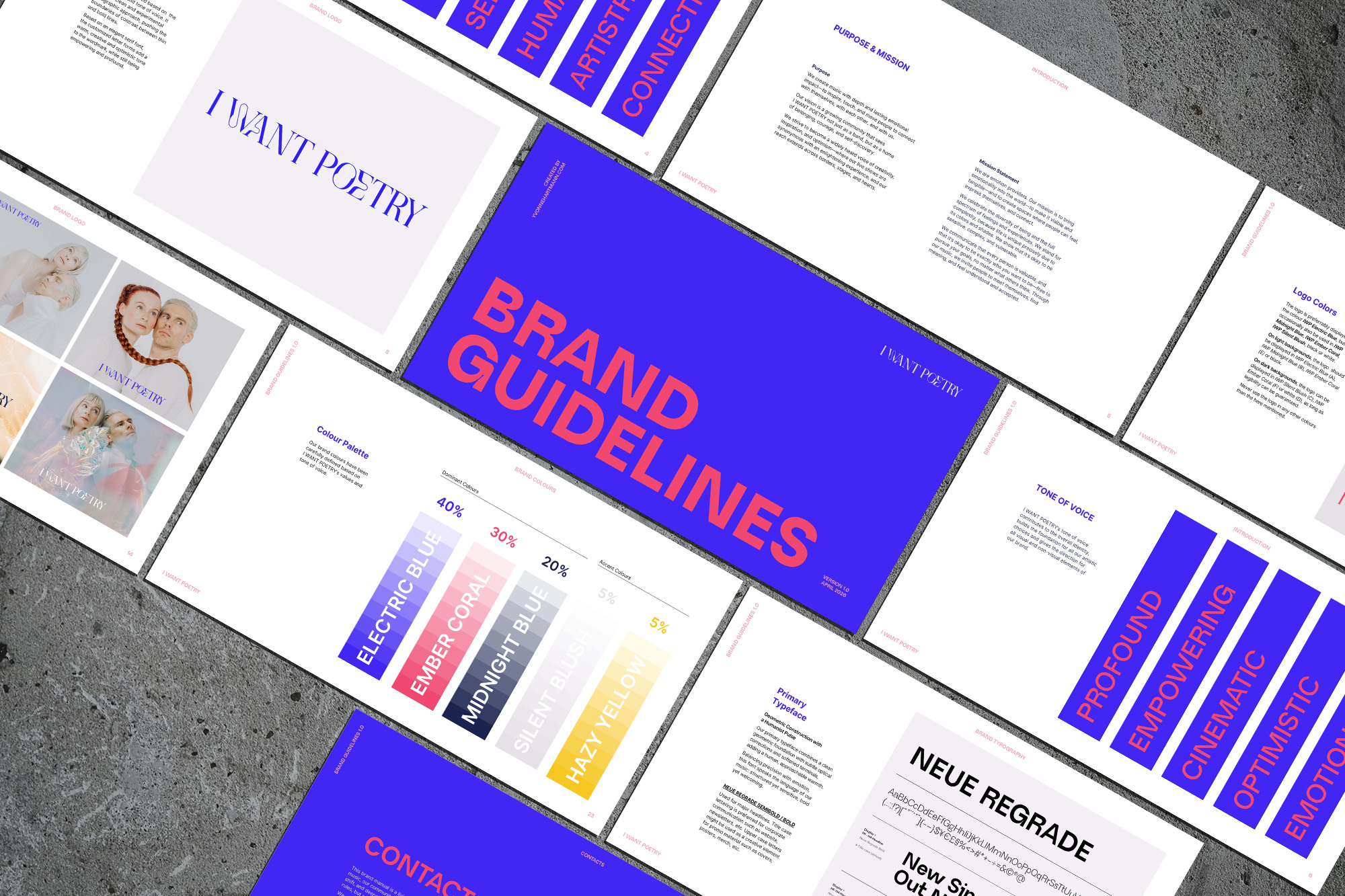
The I WANT POETRY logo is set in PS Paradiso — a serif typeface with an elegant, slightly unconventional character that sits between classical and contemporary. The wordmark is confident and open, with customized, round letter forms that bring in a warm and cinematic touch. Two weight variants allow the mark to scale from an intimate phone screen to a festival backdrop without losing presence.
COLOURS + TYPE
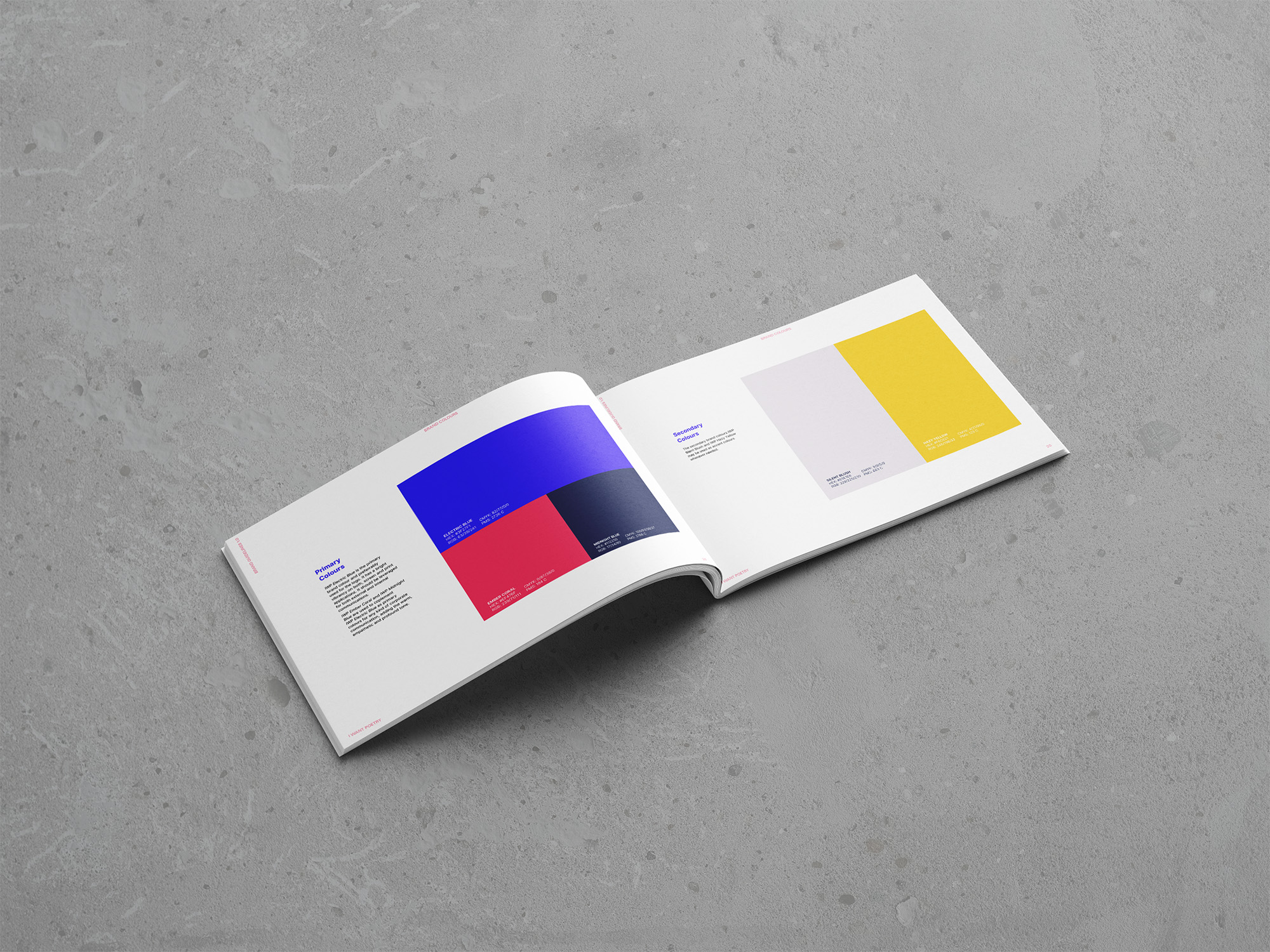
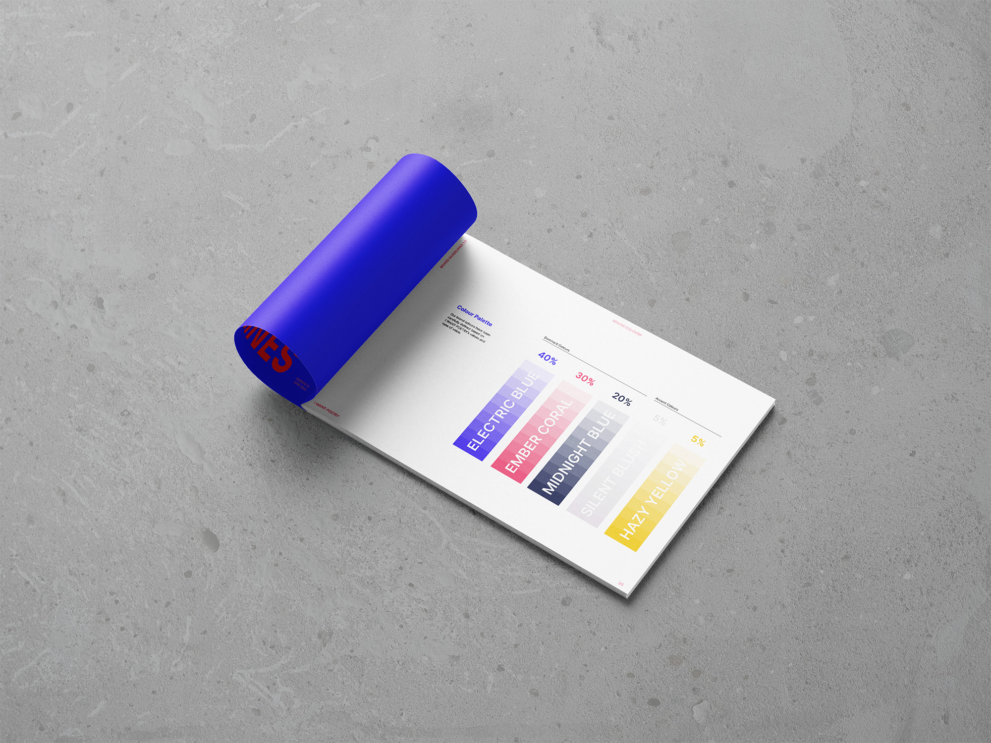
The color palette translates I WANT POETRY’s tone directly into color: optimistic and cinematic, emotionally charged, with enough depth to feel profound:
Electric Blue carries the energy — vivid, forward-moving, impossible to ignore.
Ember Coral brings the emotional register: warm, human, empowering.
Midnight Blue grounds both, adding the introspective weight that keeps the palette from tipping into pure spectacle.
Silent Blush and Hazy Yellow hold the quieter, more intimate moments — light where everything else pushes forward.
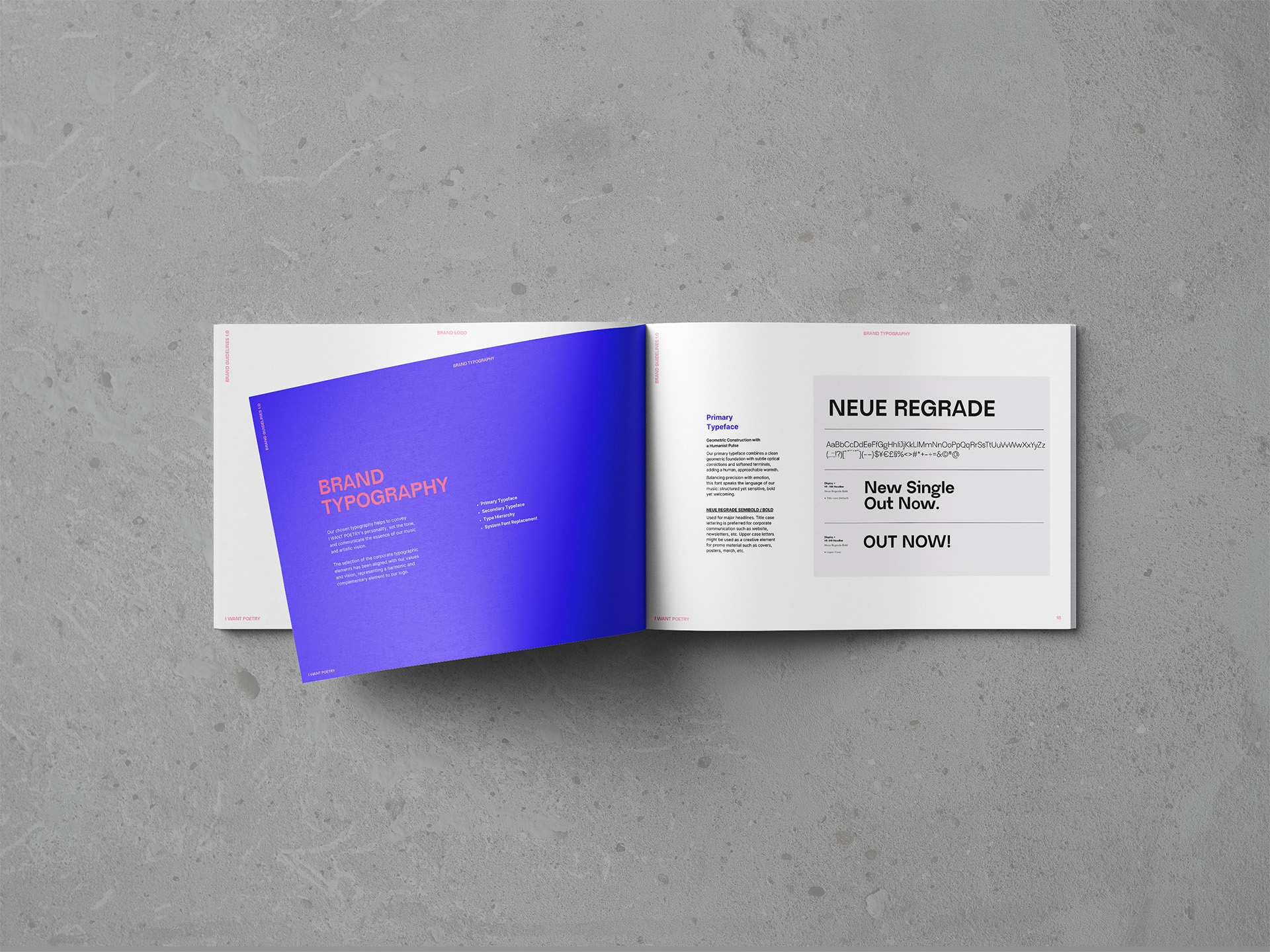
The type system follows the same logic.
Neue Regrade leads with geometric in construction, humanized by softened terminals — structured yet sensitive, the way the music is.
Inter steps aside and lets the message speak, its neutral openness supporting without competing.
Chivo Mono handles the functional layer — dates, tracklists, catalog data — bringing in a quiet sense of precision and honesty.
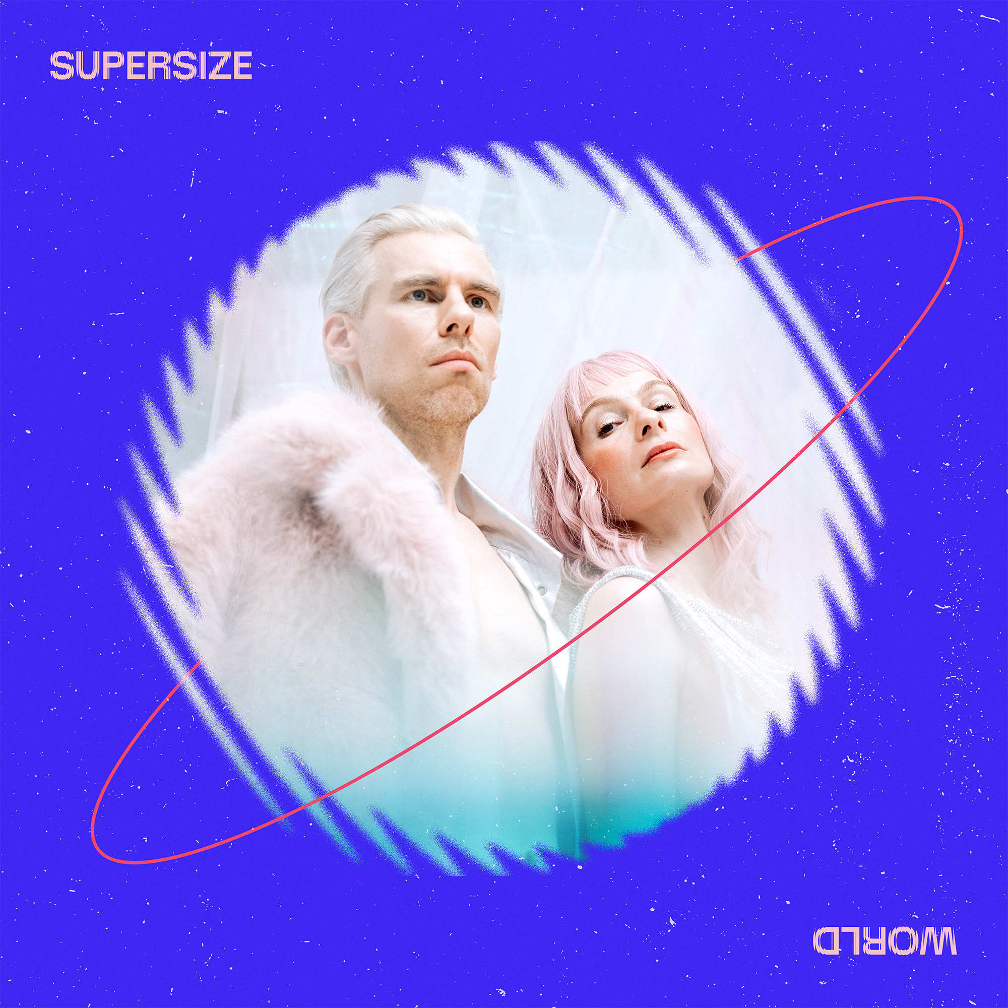
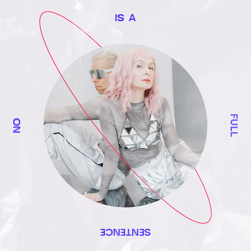
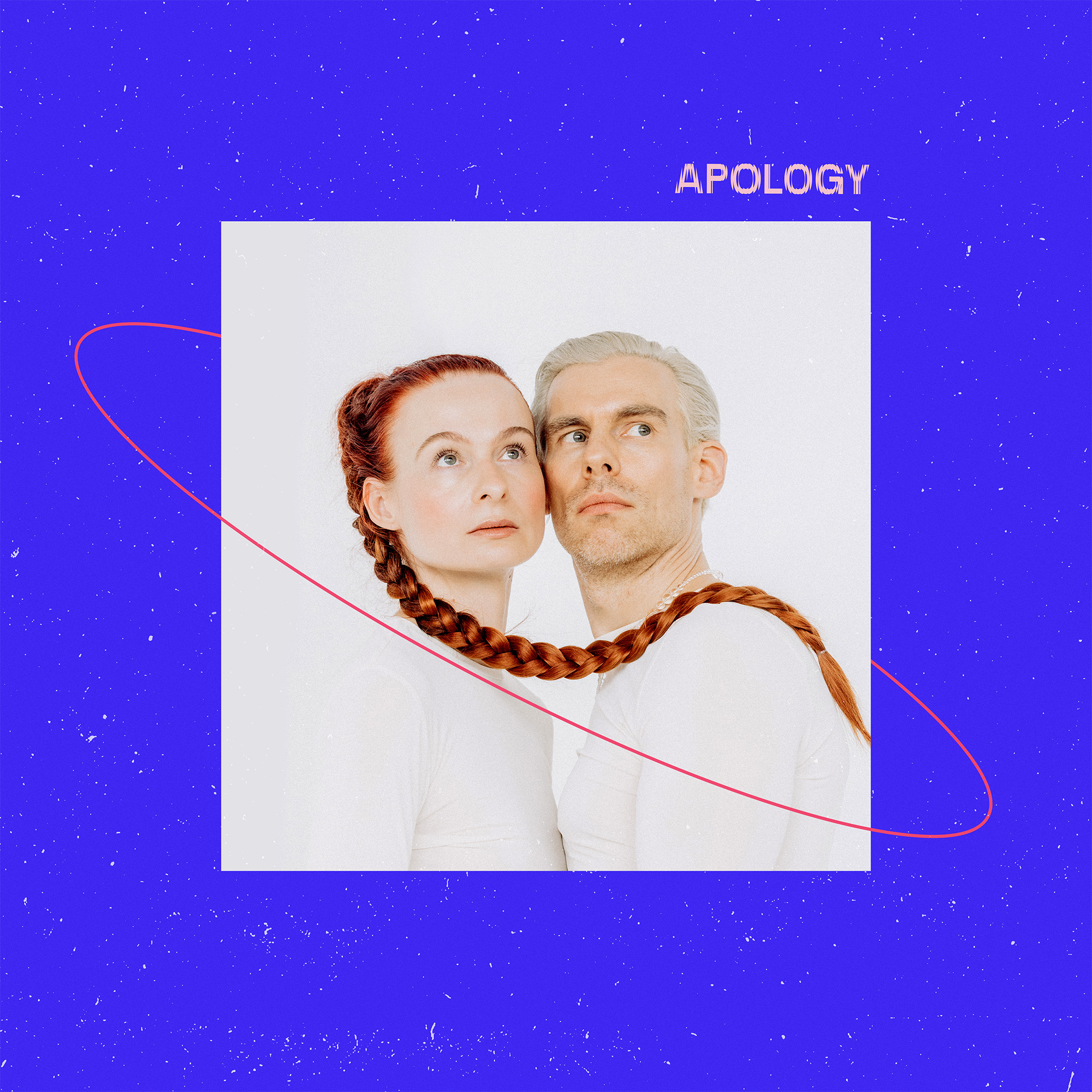
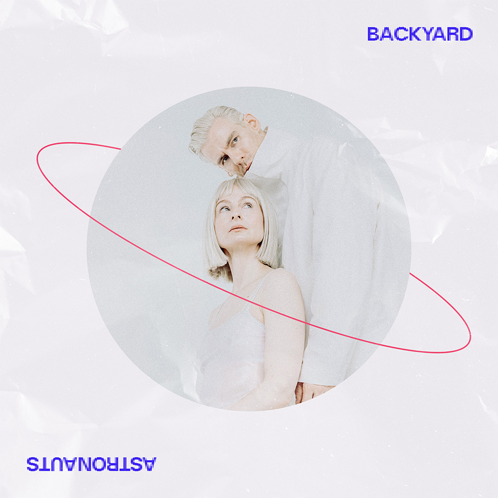
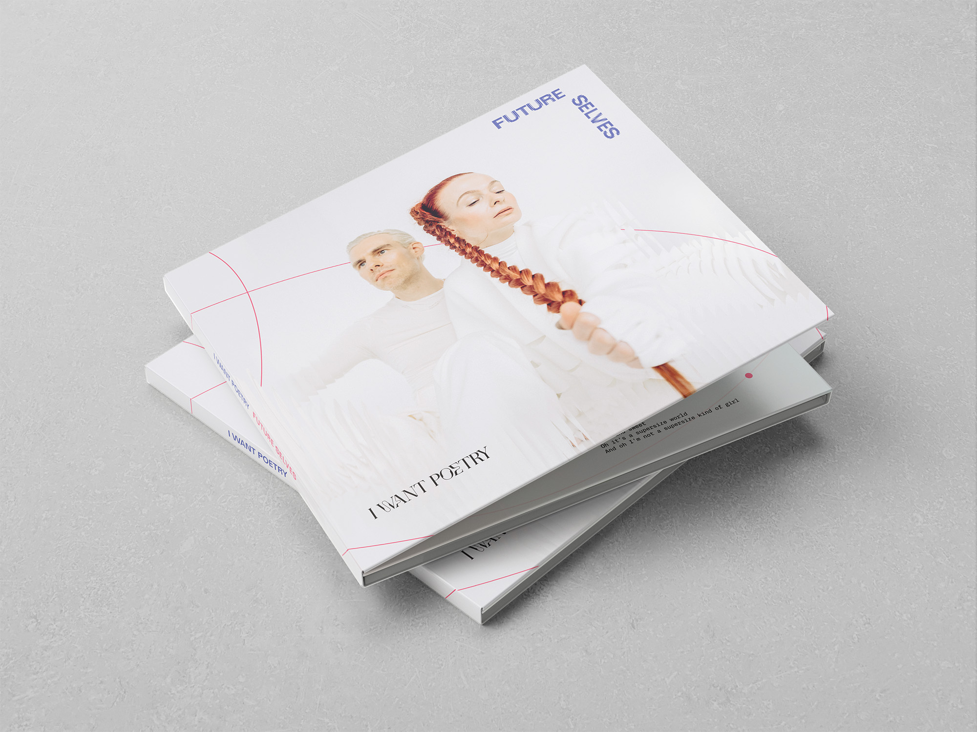
The identity launched simultaneously with I WANT POETRY’s album campaign — by design. Future Selves gave the new brand its first full expression: six single covers, album artwork, vinyl sleeve, and CD packaging, all built on the new visual system.