For the album “Future Selves“ by Dresden-based duo I WANT POETRY, I created a full release campaign — six single covers, album artwork, vinyl sleeve, and CD packaging.
The album campaign doubled as the launch of I WANT POETRY’s new brand identity. The new colors and typography weren’t a coincidence — they already lived in the album’s world. The rebrand and the release landed together.
Future Selvesis an album about holding onto the idea that things can be different — shaped by memory, imagination, and the will to build what comes next. It looks back at past utopias not with nostalgia, but with intent.
The visual direction had to carry the same charge. Retro-futuristic as a genuine belief, not an aesthetic trend. Optimistic, but earned. The design system is built on four themes that guided every decision: retro-futuristic, optimistic, visionary, transformative.
CLIENT
I WANT POETRY
SCOPE
art direction, single + album cover artwork, vinyl sleeve, cd packaging
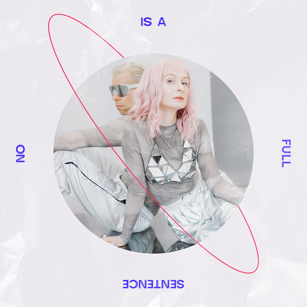
With seven releases leading up to the album, the campaign needed both consistency and stamina. I built a template fixing the core structural elements — an orbital ellipse running through the composition, masked photo shapes (circle or square), and a condensed display typeface with the same distortion effect as found on the album cover. Backgrounds alternate between Electric Blue and Silent Blush, with crumpled paper and cosmic dust textures adding physical weight to the campaign’s retro-futuristic world.
What changes across releases: the photo crop, the color register, occasional typographic inversions — mirrored or rotated titles that break the grid just enough to keep each cover distinct. The orbital ring is the system’s signature. Part planetary trajectory, part looping thought — it holds the campaign together visually while allowing each single its own moment.
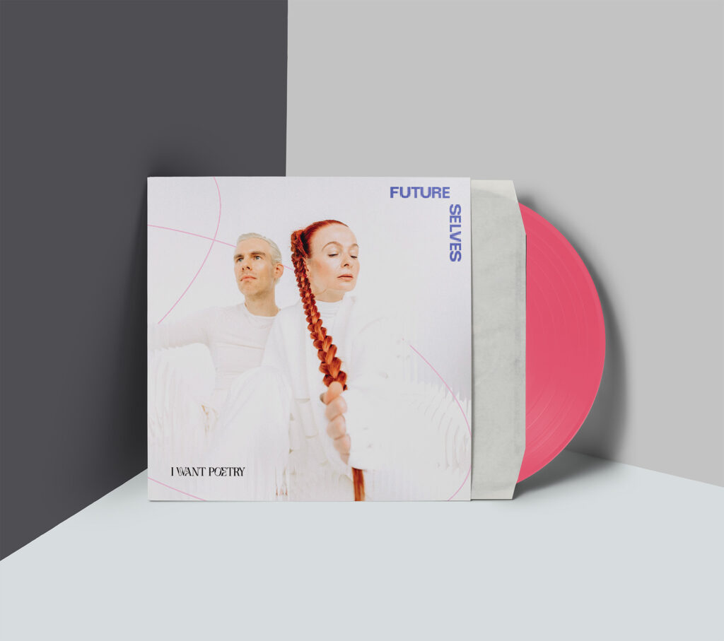
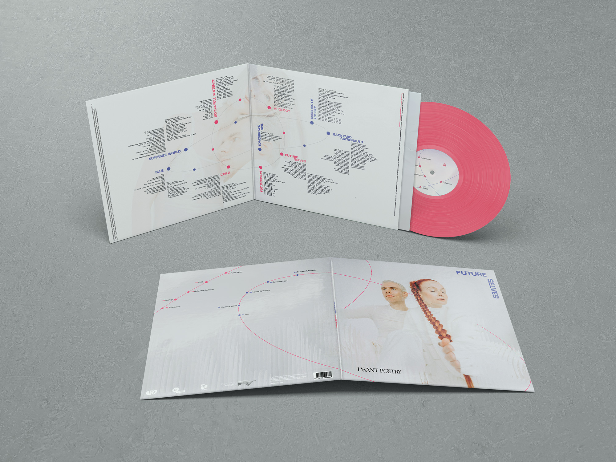
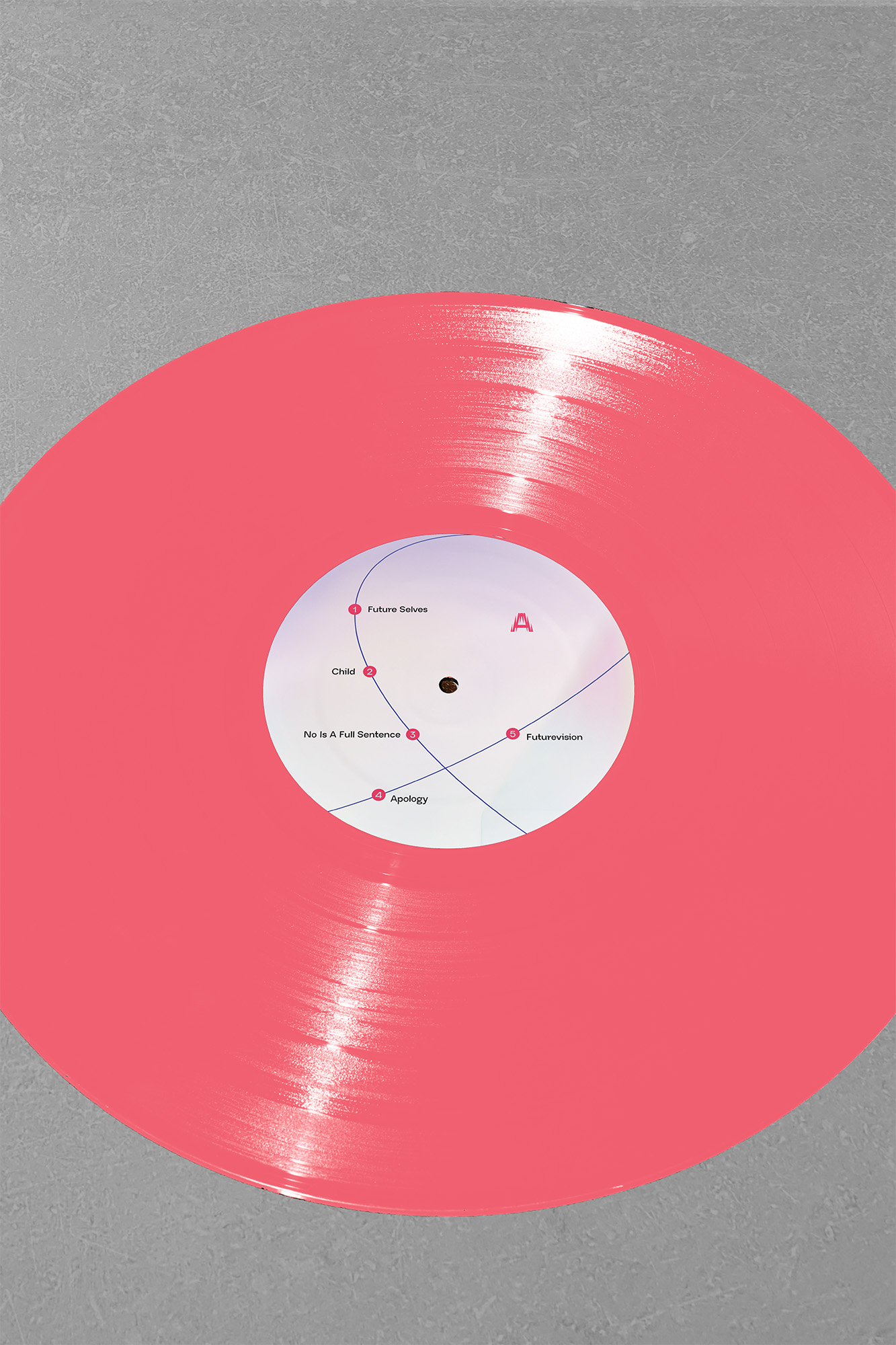
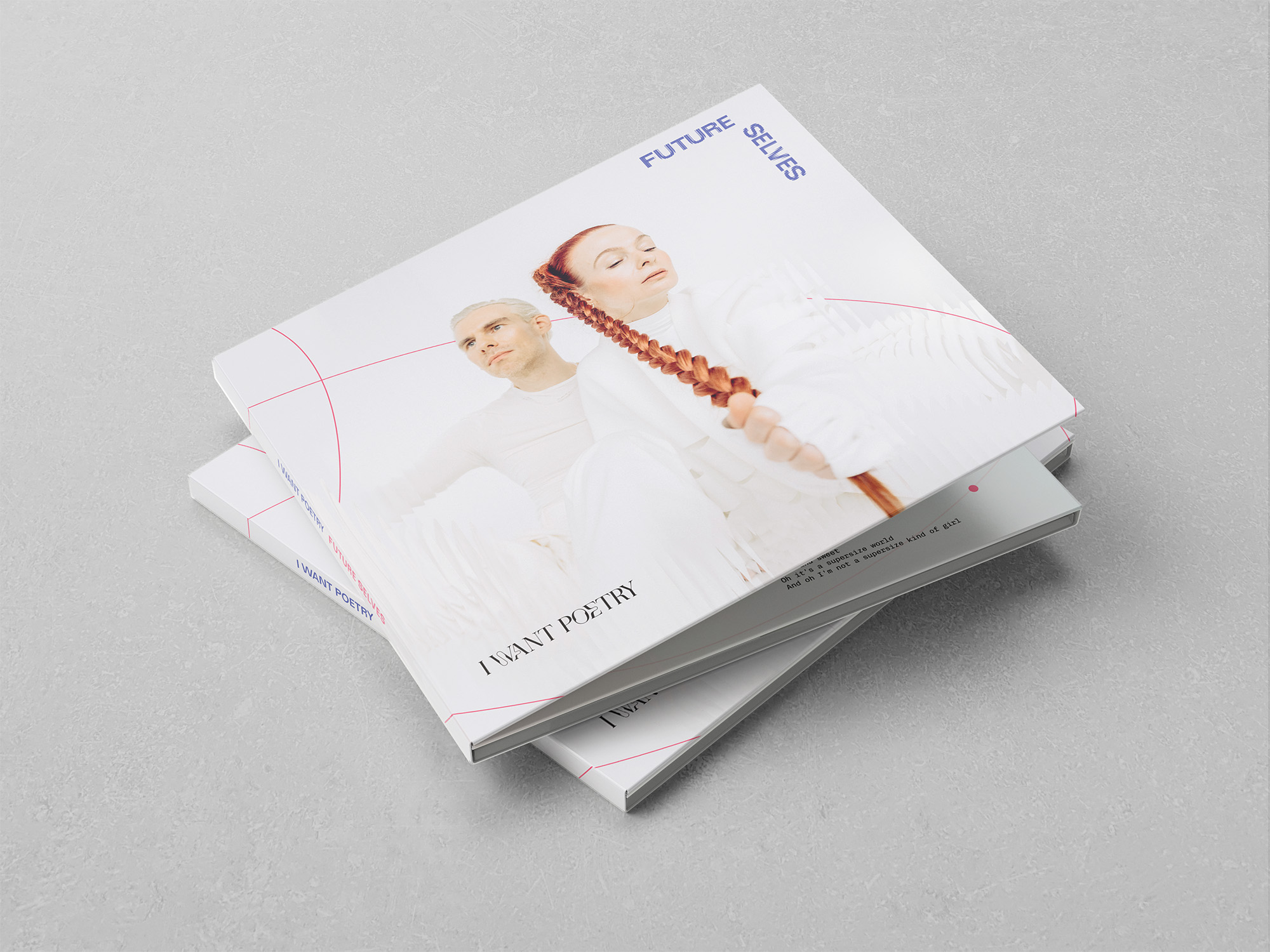
ALBUM COVER + VINYL SLEEVE
The album cover shifts register from the singles. Where the campaign builds energy through saturation and motion, the sleeve opens into restraint: white space, the two artists in pale, architectural light, the title split across the corner in the brand’s display type.
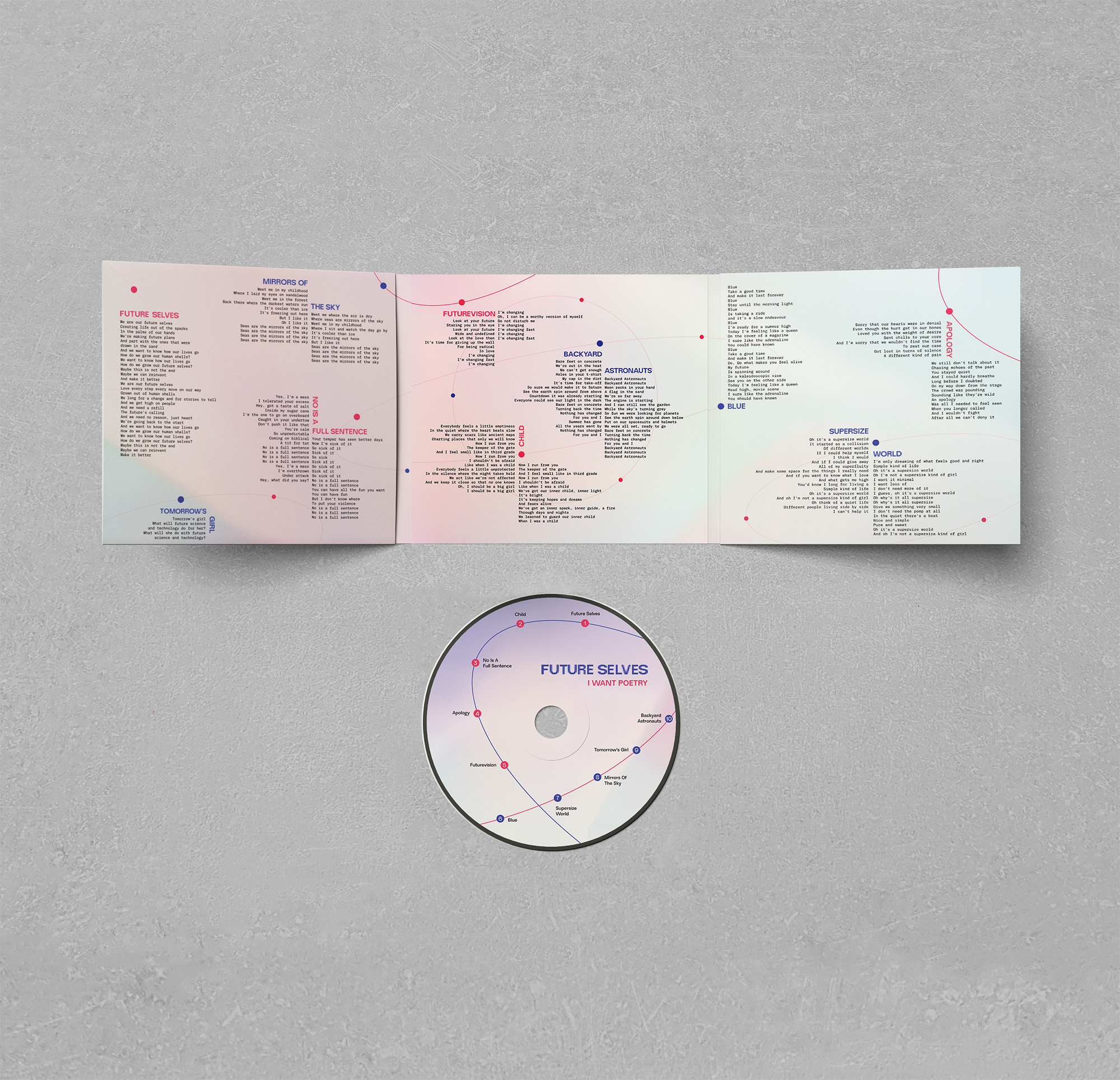
The gatefold interior maps all ten tracks as a constellation diagram — song titles plotted like stars, connected by the orbital ring motif that runs throughout the singles campaign. Lyrics fill the panels in tight columns, set in Neue Regrade and Inter, small enough to reward attention.
The vinyl is pressed in hot pink. That choice was deliberate — the only fully saturated, unambiguous moment of the vinyl, reserved for the physical object.
CD PACKAGING
The CD extends the same visual system at a smaller format — constellation diagram, condensed type, orbital motif.