For the debut album „Golden Sign“ by Berlin-based artist Meravi, I created a visual identity that reflects her dreamy, horn-centered indie pop. The concept merges the music’s magical and experimental tone with subtle nods to the element gold— integrating its atomic details and scientific references throughout.
CLIENT
Meravi
SCOPE
Art Direction Photography Campaign Design Print Design
THEMES
Day-dreamy Magical Experimental
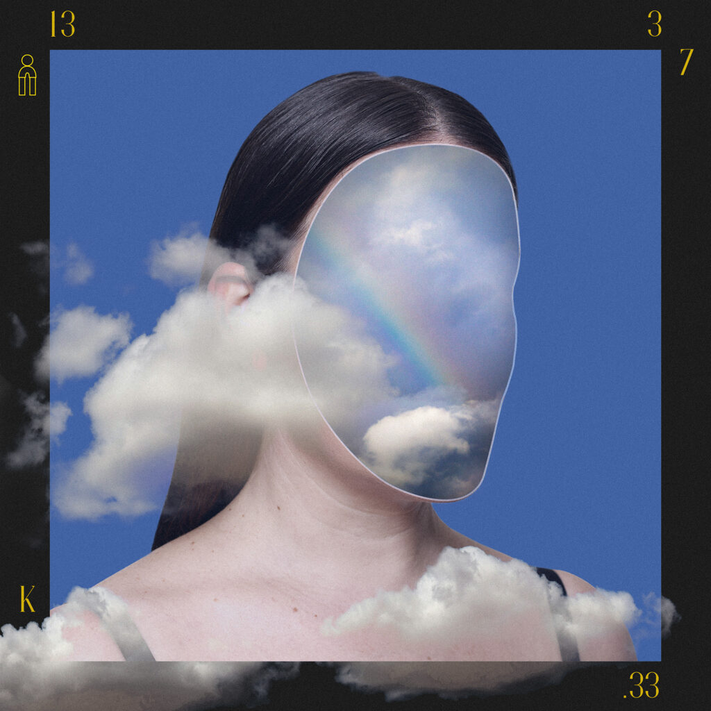
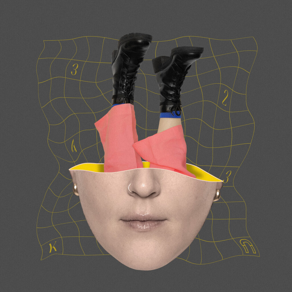
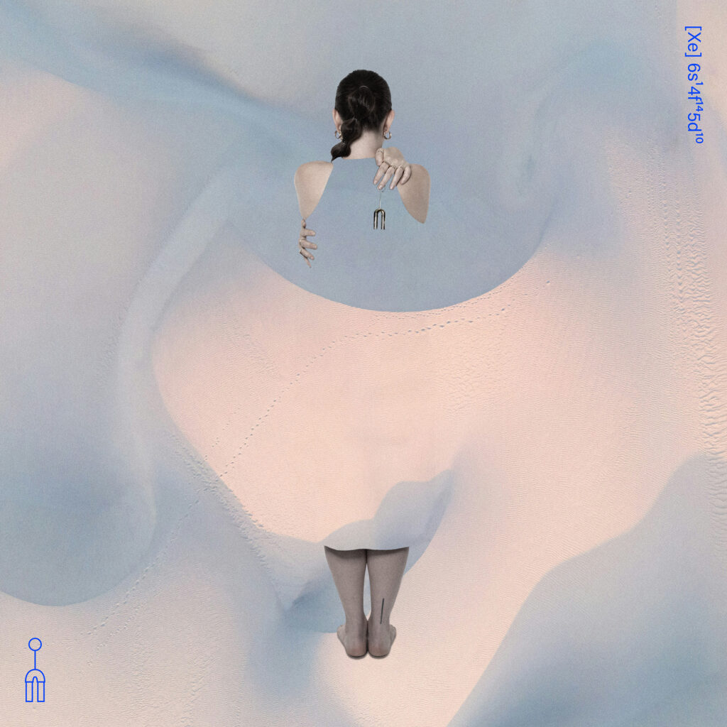
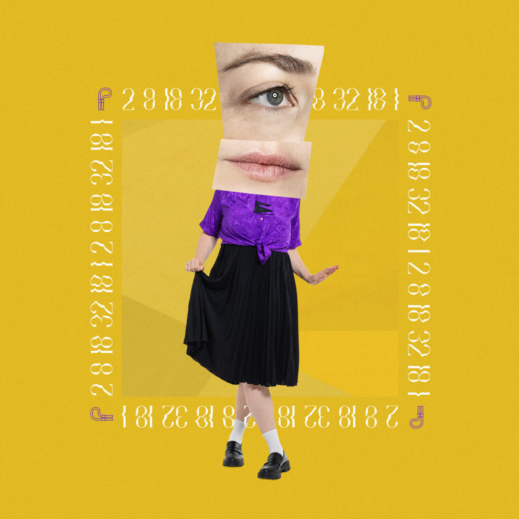
Single Covers
For the singles, we used specially-shot photos of the artist combined with a carefully selected colour palette and typography. Without revealing the artist’s face, each cover captures the essence of its respective song, contributing to a larger visual narrative throughout the campaign that sparks curiosity and invites deeper attention. The chemical numbers and subtle outline illustrations of various parts of the instrument serve as understated clues, hinting at what will be revealed on the album cover.
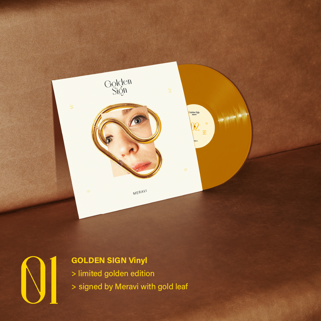
Album Cover + Vinyl Sleeve
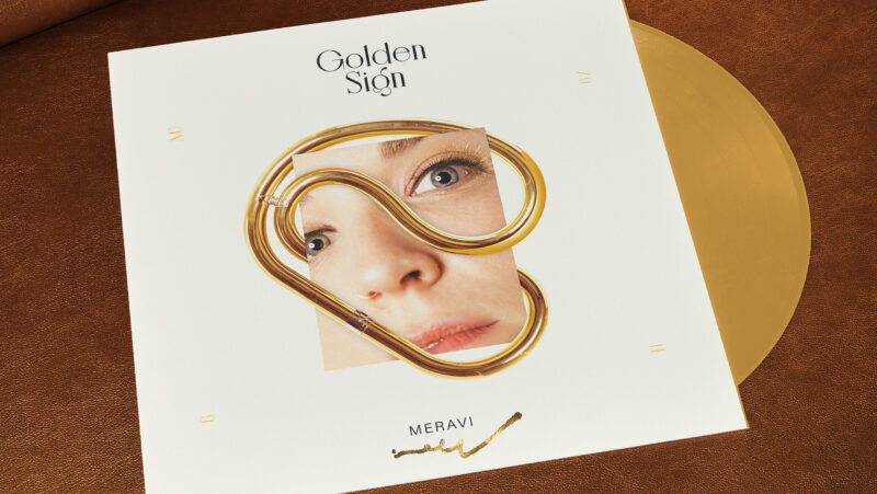
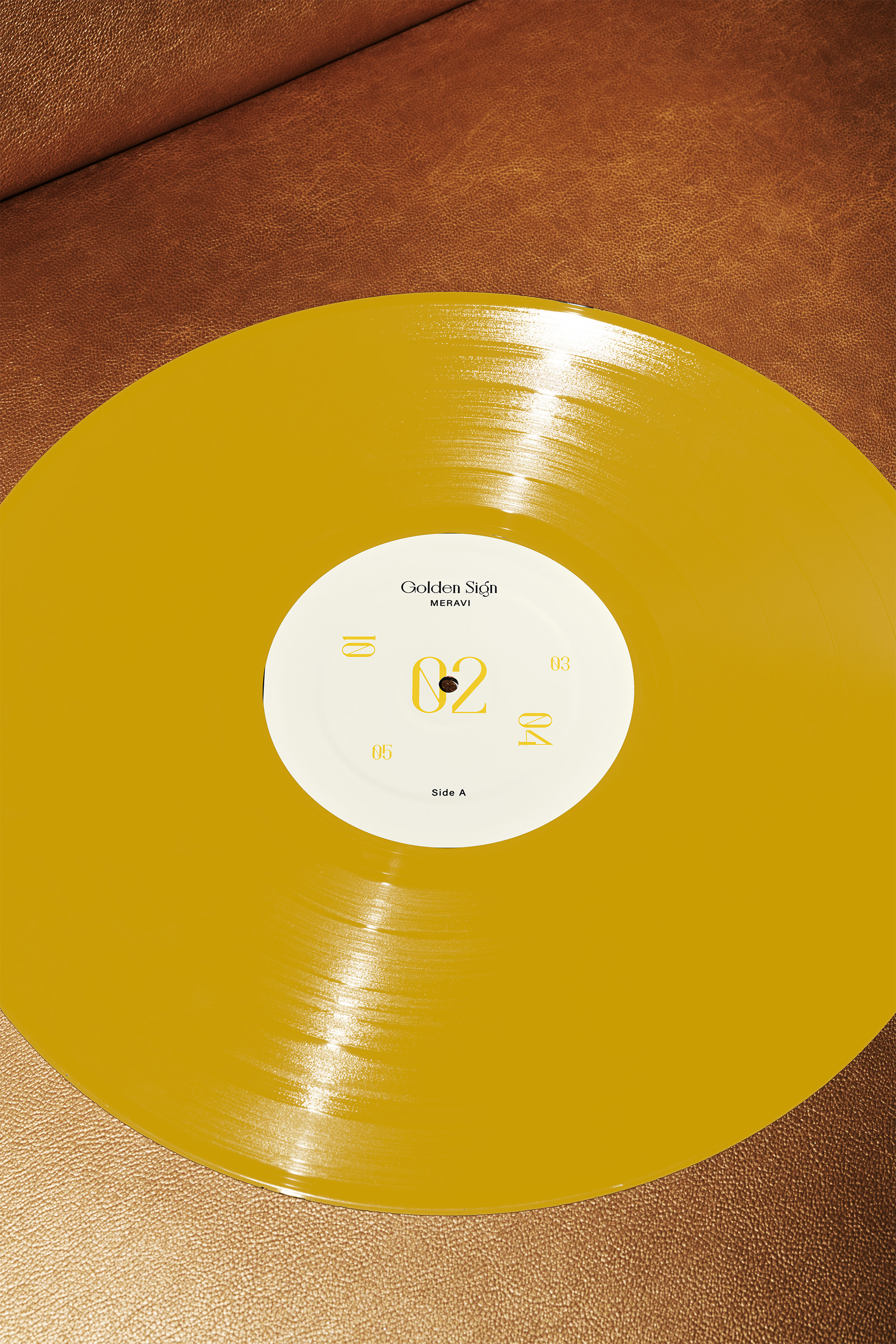
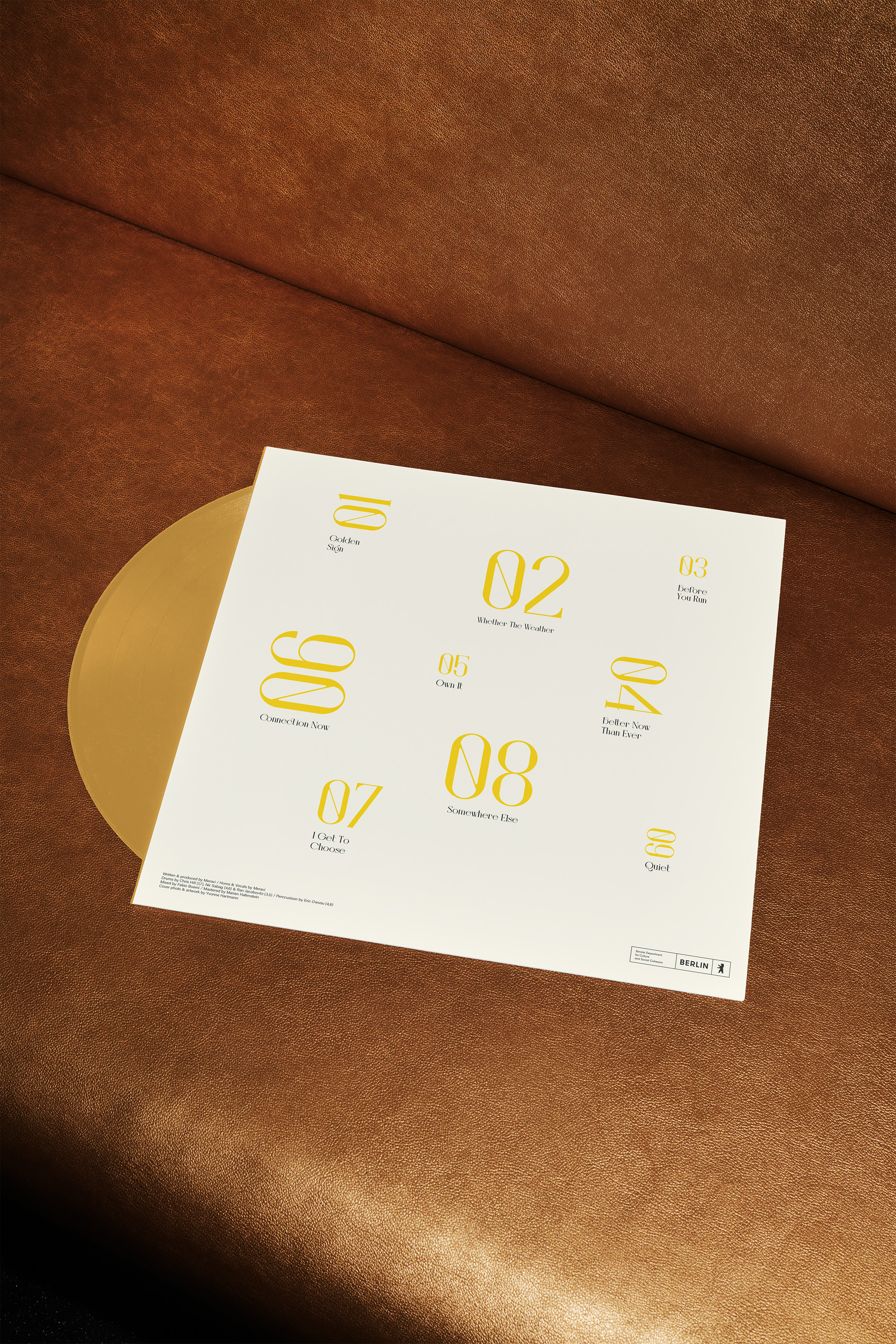
The album cover reveals Meravi’s face alongside an abstract representation of the horn, capturing the profound connection between the artist and her instrument. The finishing touch is the artist’s hand signature in gold leaf, featured on a limited edition of the vinyl sleeve.
Social Media Competition
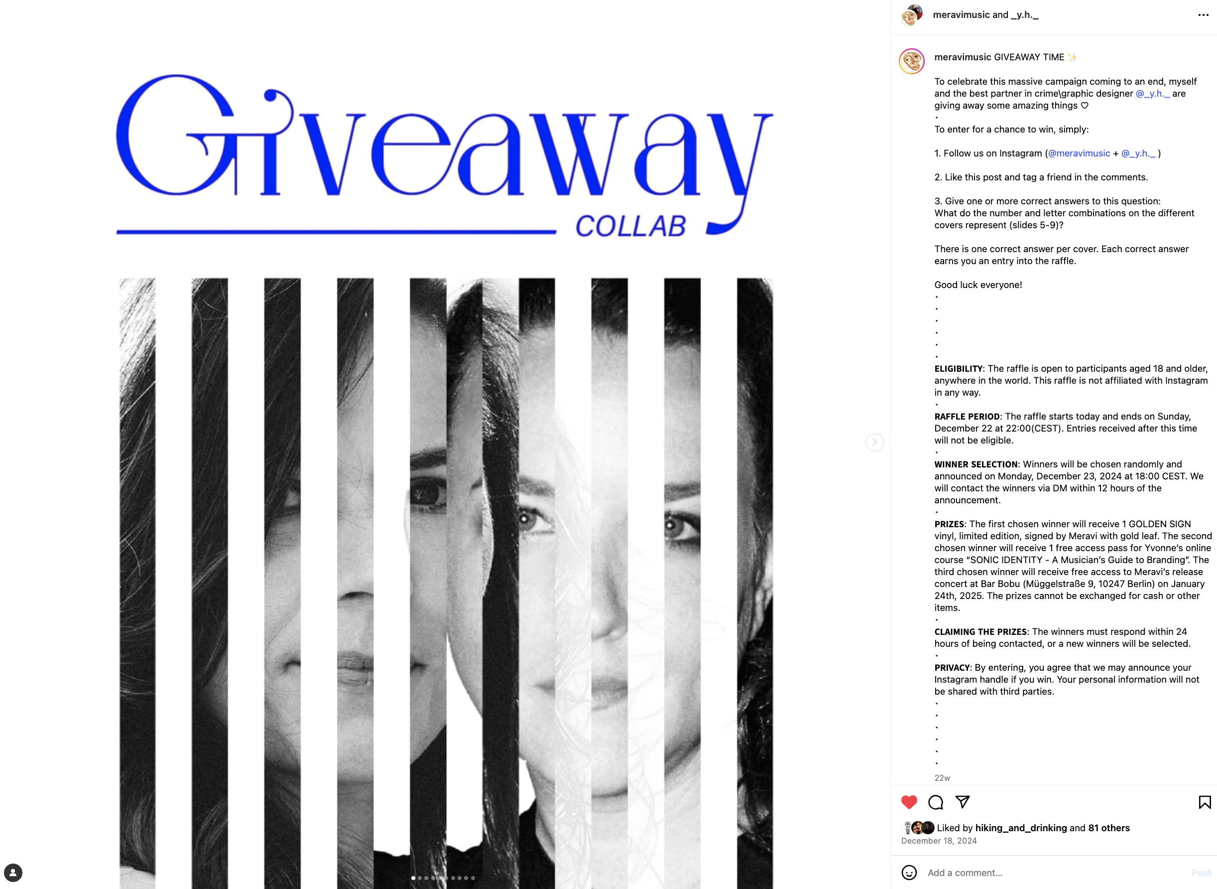
Each single cover features cleverly integrated chemical clues—such as the melting point, the boiling point, or the atomic number of Gold—offering a playful promotional twist. A competition invited fans to decode the visuals, transforming the release into an interactive experience.
// iMUSICIAN //
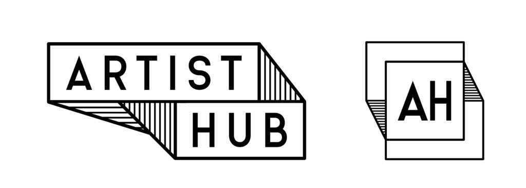
ARTIST HUB
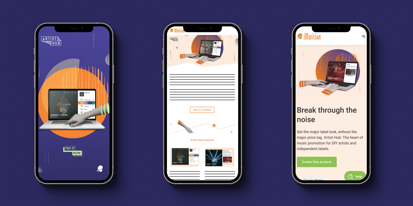
iMusician is a music distribution company built on genuine partnership with artists. Launching their free ARTIST HUB smartlink required a campaign that mirrored their empowering, artist-centric ethos.
Art Direction Logos + Key Visual Campaign Design Motion Design
THEMES
Functionality Empowerment Creativity Easy to use
From the product logo to the key visual, social ads, emails, and animated web graphics, this playful approach provided the flexibility to showcase the product’s interface and features in an unexpected, engaging way.
Art Direction Campaign Assets Photography Print + Motion Design
THEMES
Transformation Progress Personal growth
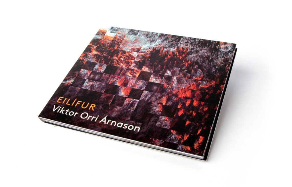
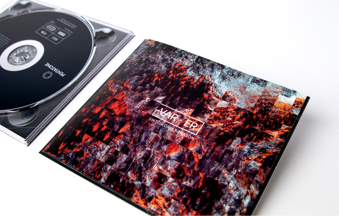
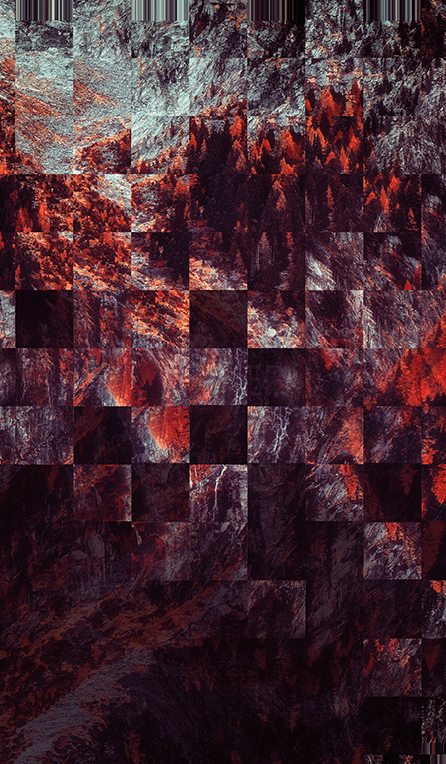
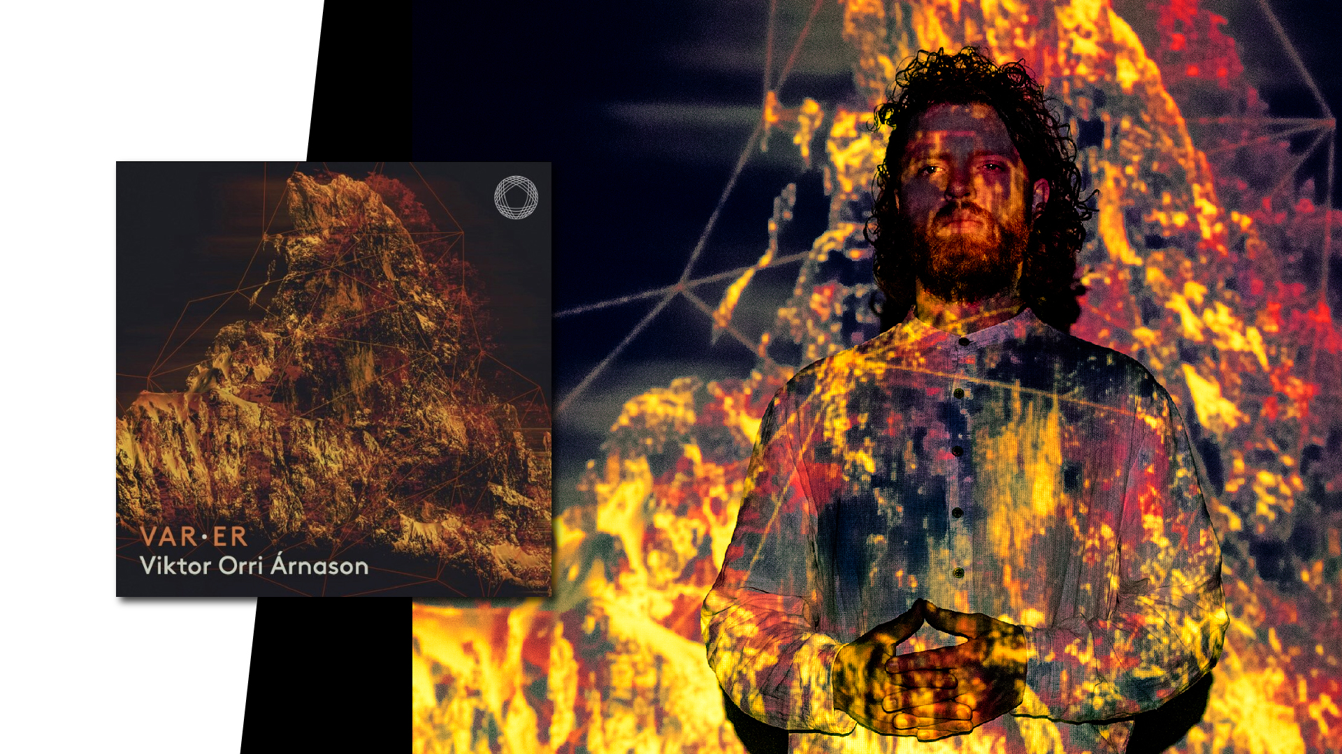
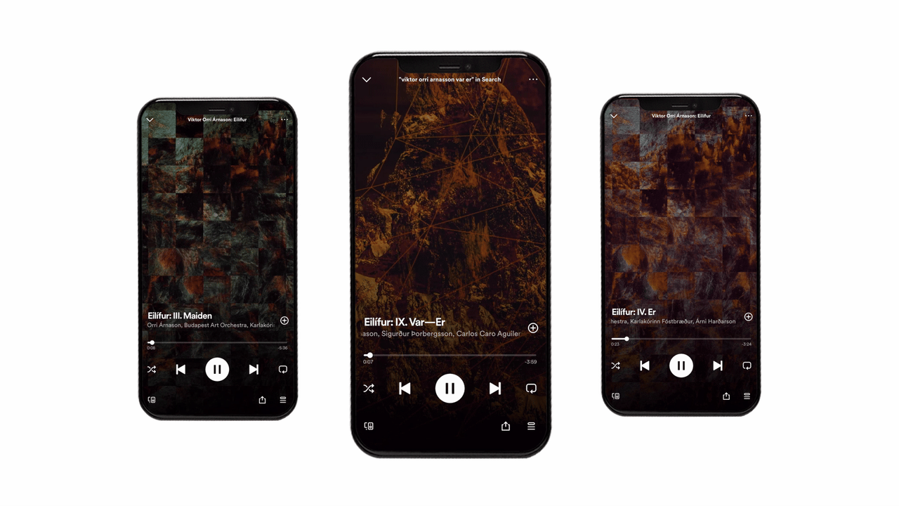
Album Cover + CD Packaging
Visually, I explored the album’s themes of progress and transformation through patterns and digital displacement techniques on the covers.
VAR-ER single cover
Spotify canvases
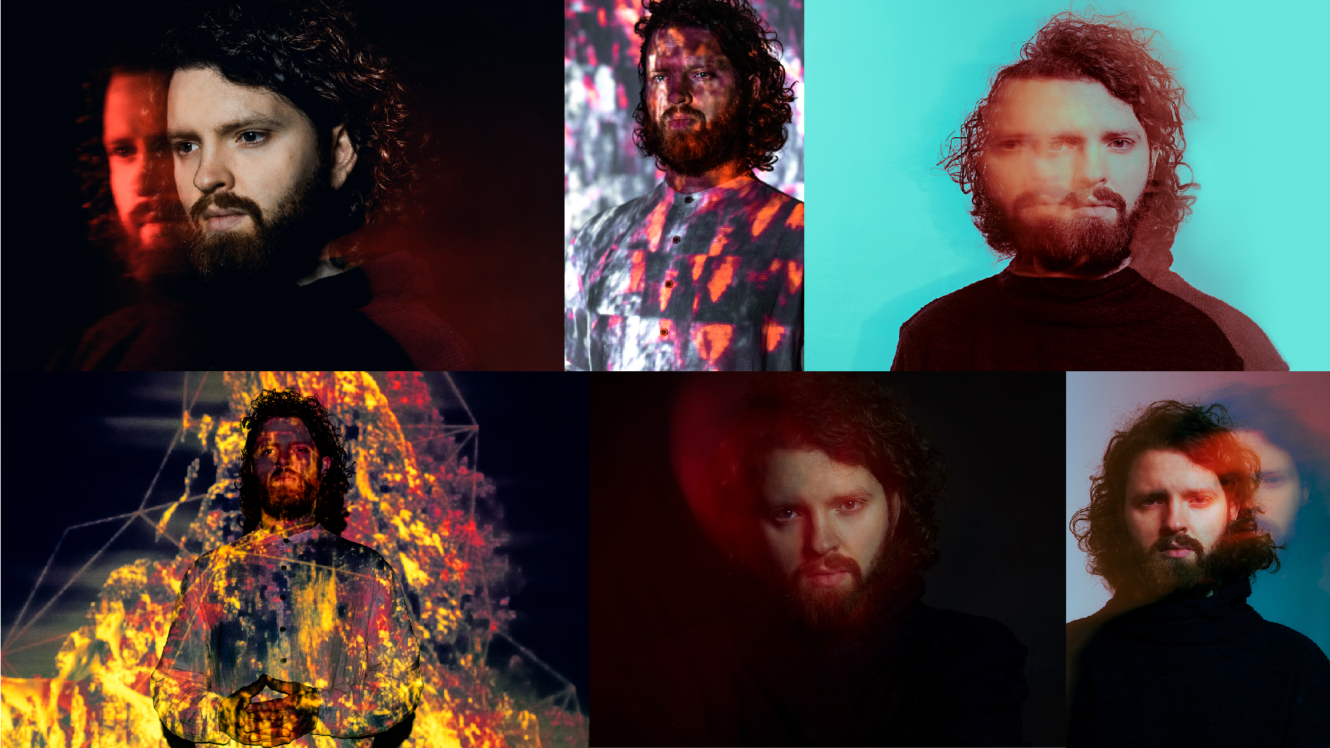
Press Photos
I employed light painting and projection during the photoshoot to create evocative double exposures, matching the album’s themes of personal growth and transformation.
NATIVE INSTRUMENTS
Native Instruments is one of the most influential companies in music technology — shaping how artists around the world create, perform, and produce.
Over seven years as a senior graphic designer and in-house photographer within their marketing department, I was responsible for the visual language of product launches, seasonal campaigns, partner collaborations, and live events.
Working at this scale meant balancing creative ambition with brand consistency, tight deadlines with considered craft, and individual campaign identities with a coherent overarching visual system.
// NATIVE INSTRUMENTS //
PRODUCT
RELEASES
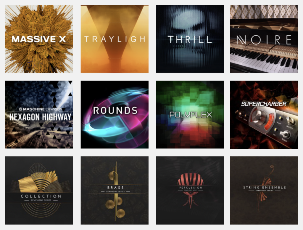
Across my seven years working as a senior graphic designer and in-house photographer within the marketing department of Native Instruments (NI), I created the visual language and identity for many of the company’s leading music software products.
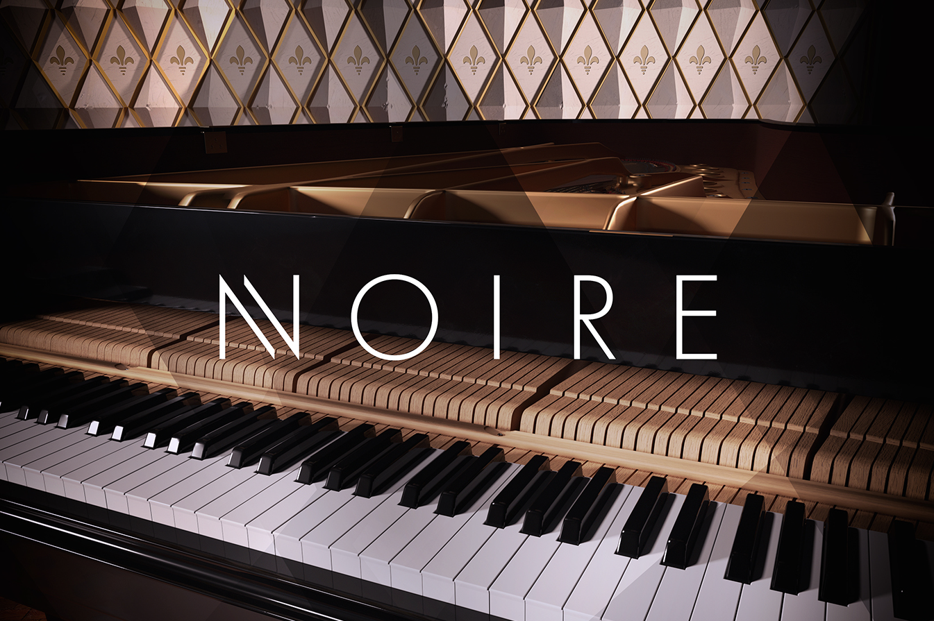
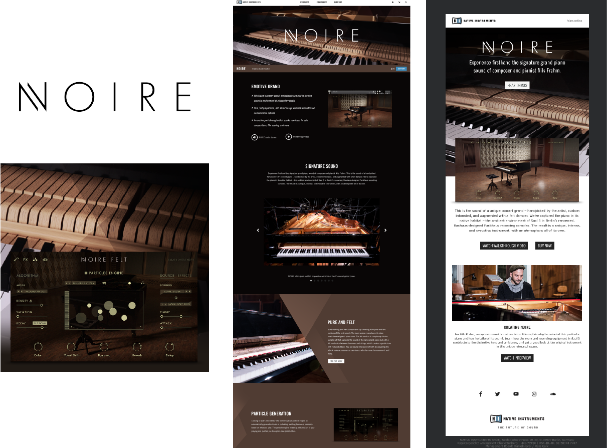
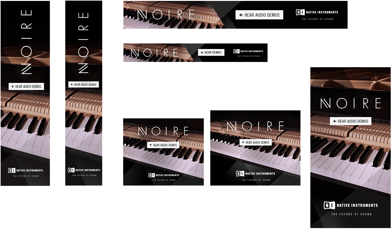
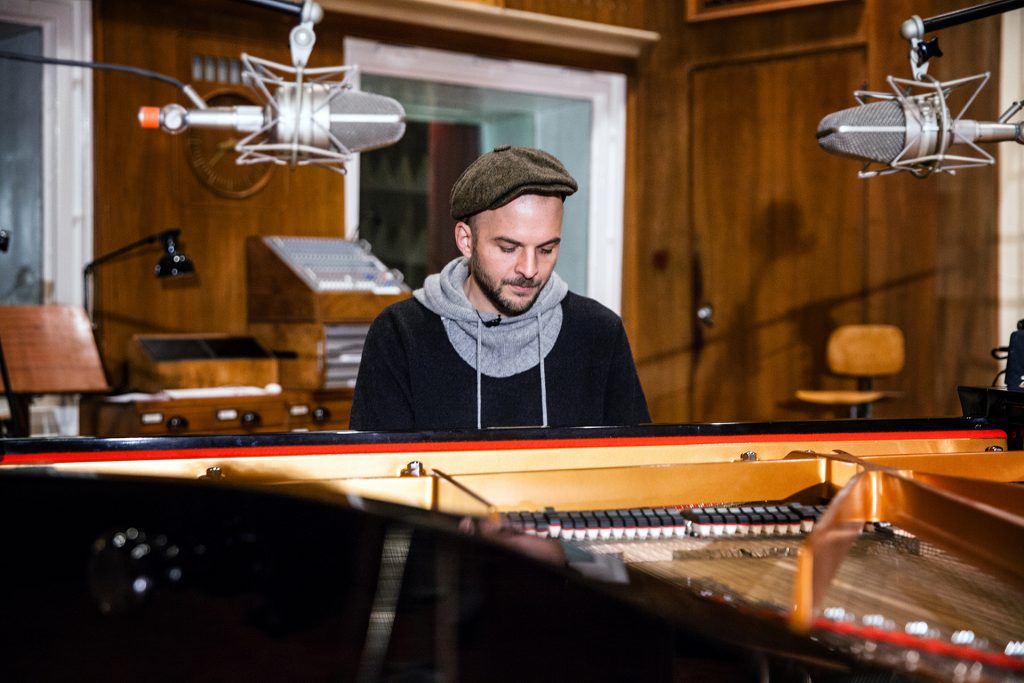
// NOIRE //
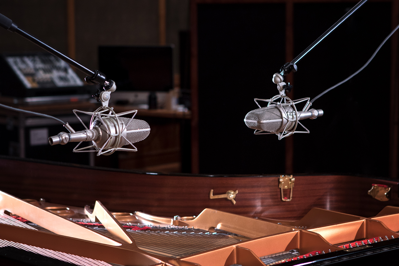
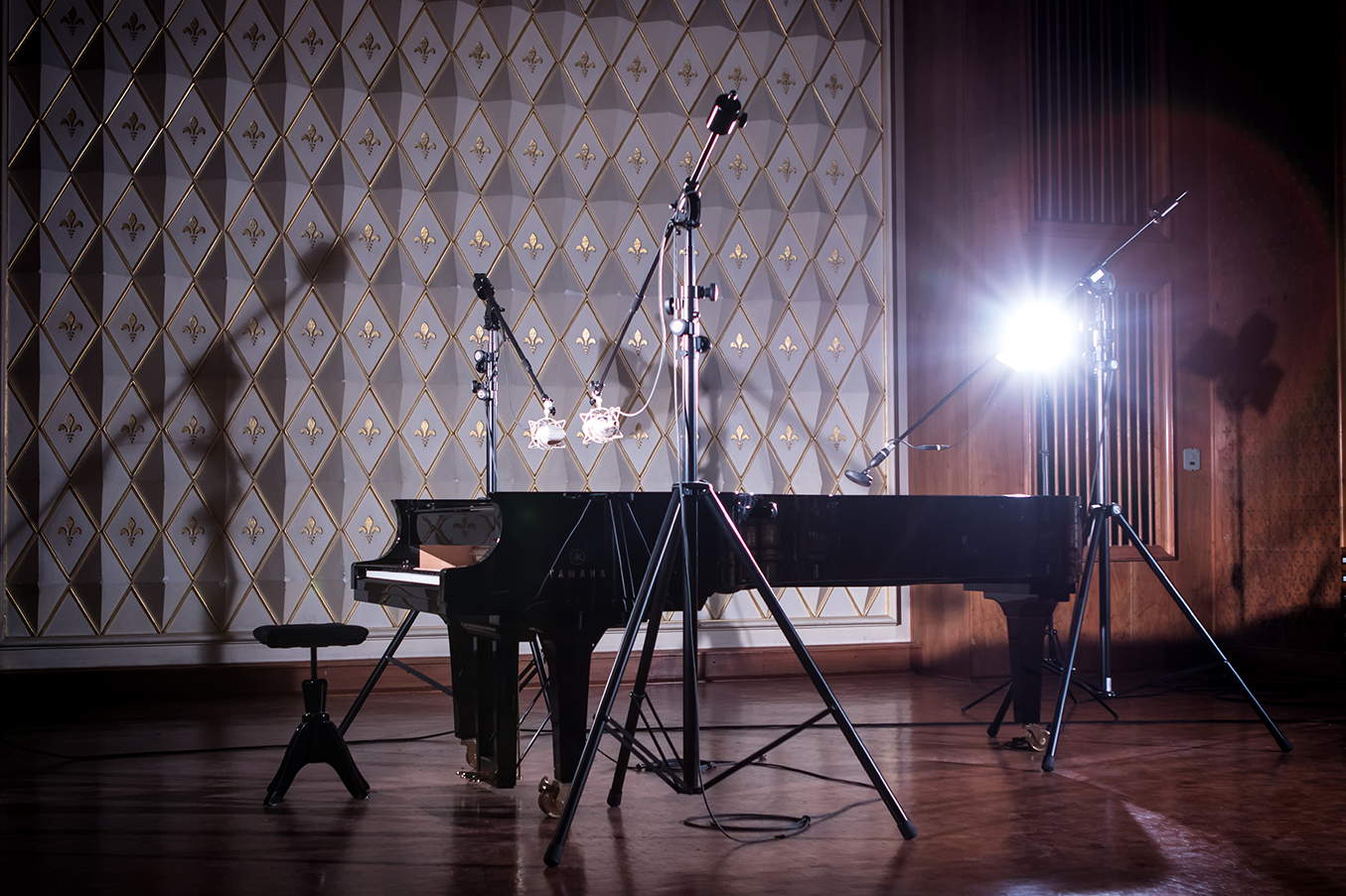
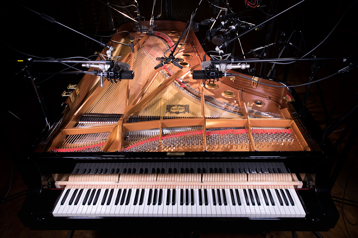
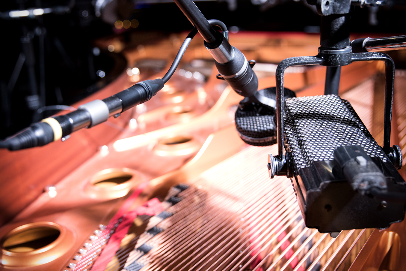
Noire is a sample library based on Nils Frahm’s customized Yamaha CFX grand piano. It offers pure and felt preparation versions of the 9’ concert grand piano.
For its release, I designed the key creative such as product logo and artwork as well as all campaign assets like product webpage, newsletter, social media formats and online banners. I was also responsible for the photos used for product and content marketing campaigns. Visit additional content campaign.
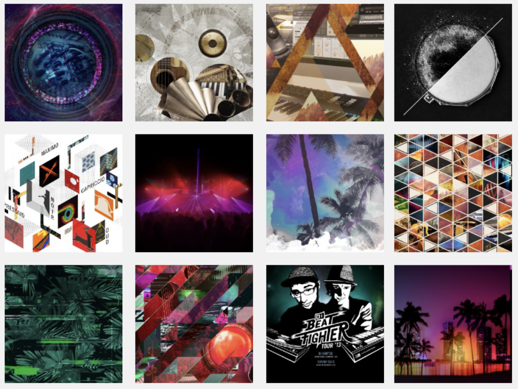
At Native Instruments I was also responsible for the visual concepts of seasonal sales campaigns such as Thanksgiving, Summer of Sound, and other important campaigns like the NKS specials or The Beatfighter Tour.
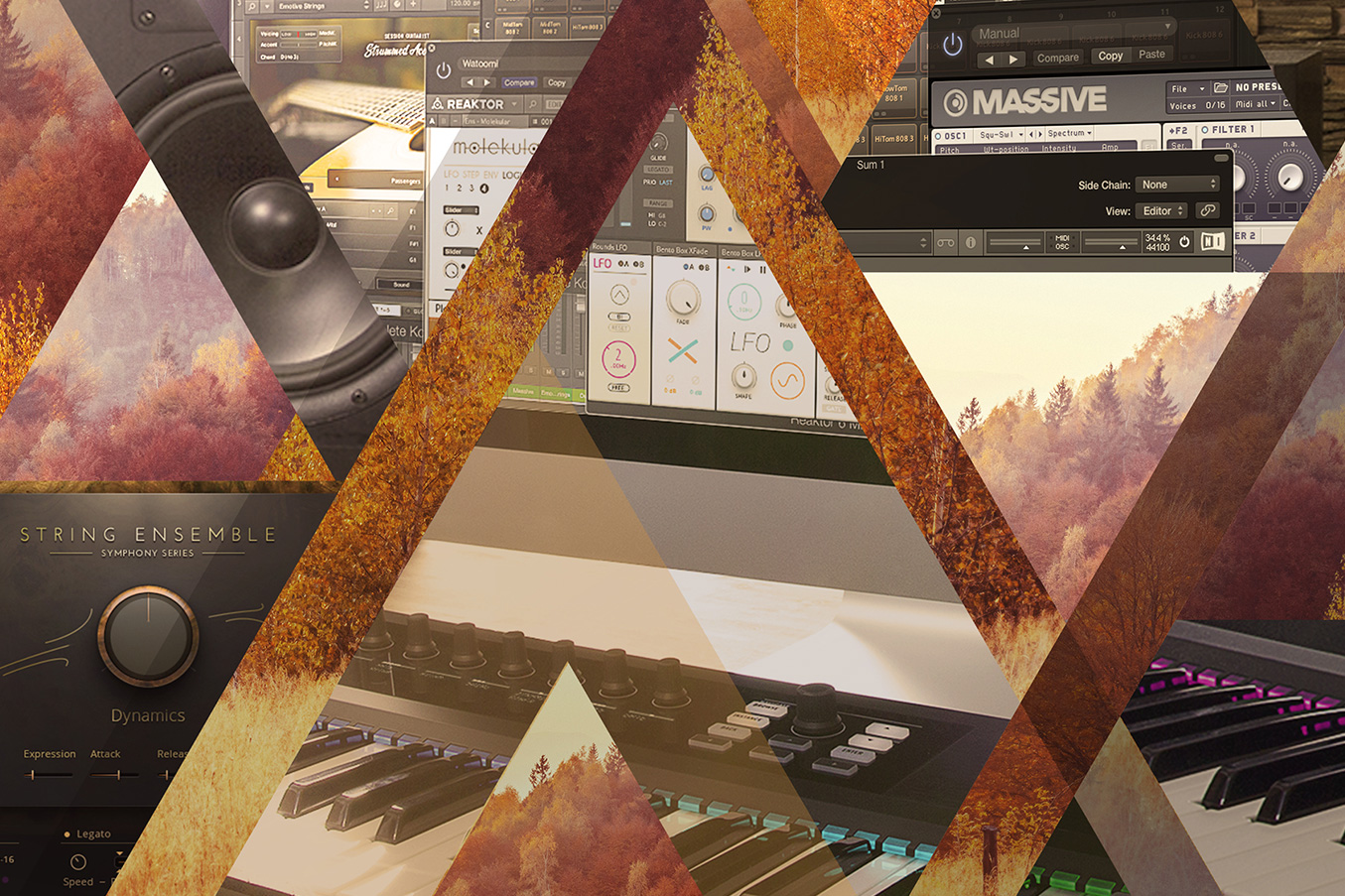
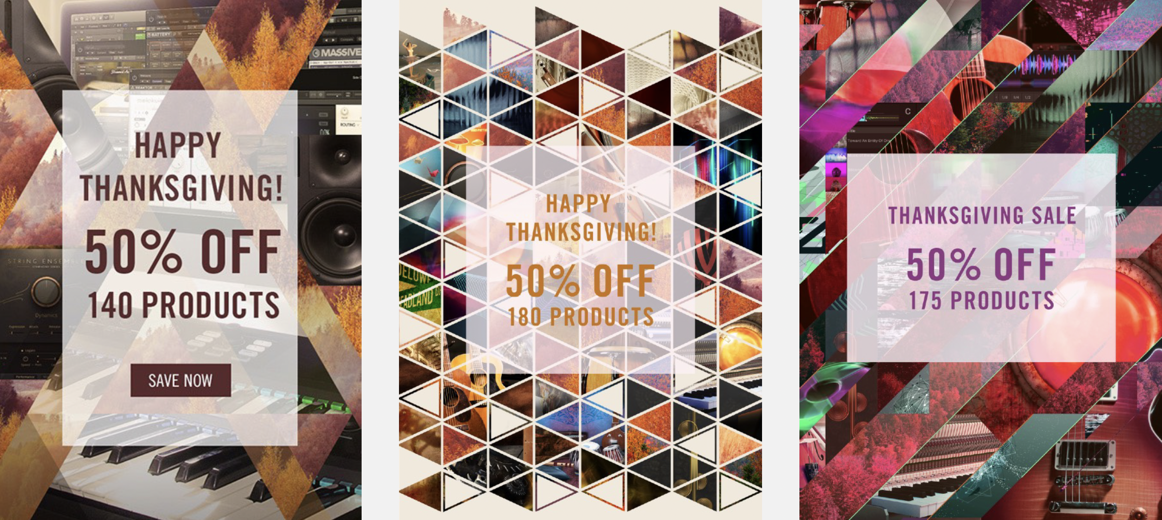
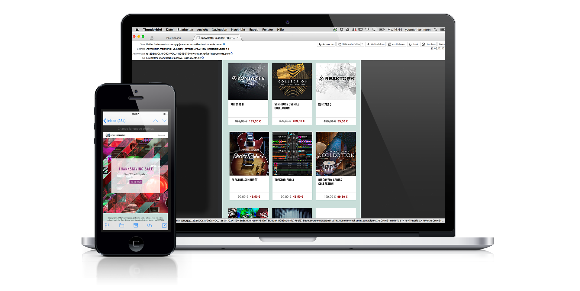
// THANKSGIVING //
At NI the Thanksgiving campaign is one of the most important campaigns of the year – with big discounts on all of their products.
As the responsible designer for seasonal campaigns I helped to develop a new creative concept with more abstract and contemporary designs, creating a fresher look and feel, higher functionality and easy adaption of the different campaign assets. All campaigns included the design of the key visuals and all marketing assets such as newsletters, online banners, social media formats, website images and press kit.
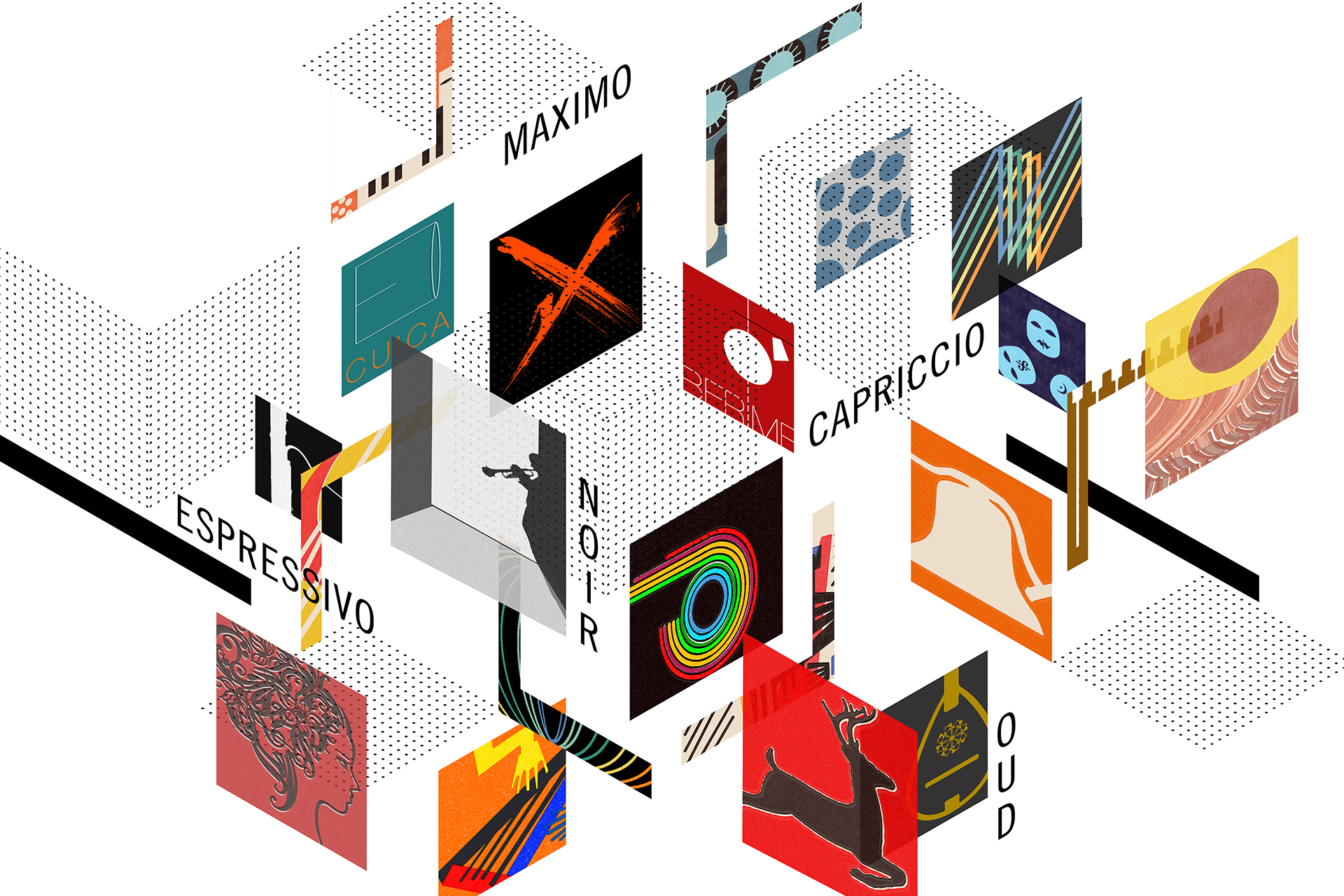
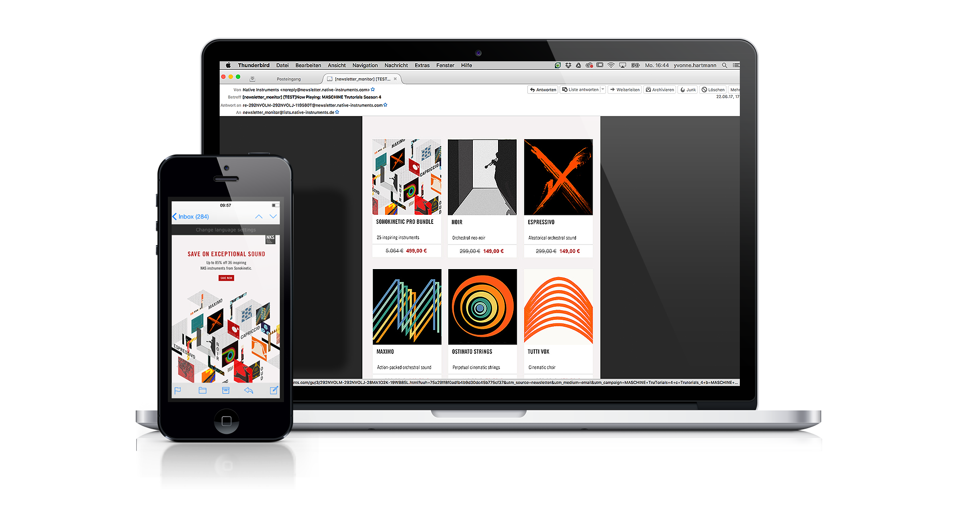
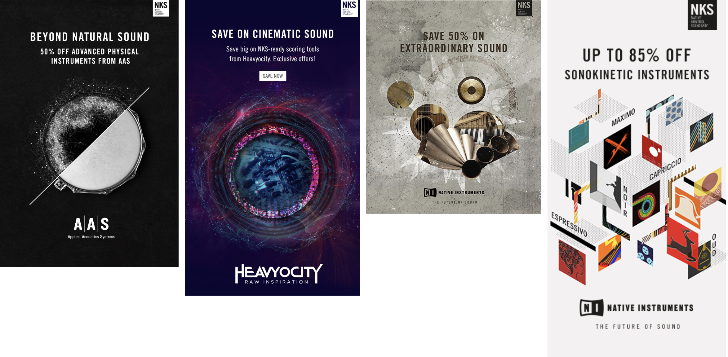
NKS (Native Kontrol Standard) is a format created by NI that allows to bring software instruments, effects, loops and samples into one intuitive workflow – creating seamless integration between NI and other leading developers.
Over the years NKS became an industry standard and NI regularly teamed up with software developers to push their NKS-ready products. Since the beginning the challenge of the NKS campaigns was to find a creative concept that respects the style guides of both, NI and the corresponding partner company. The individual campaigns included the design of the key visual and all marketing assets such as landing pages, newsletters, online banners, social media formats and press kits.
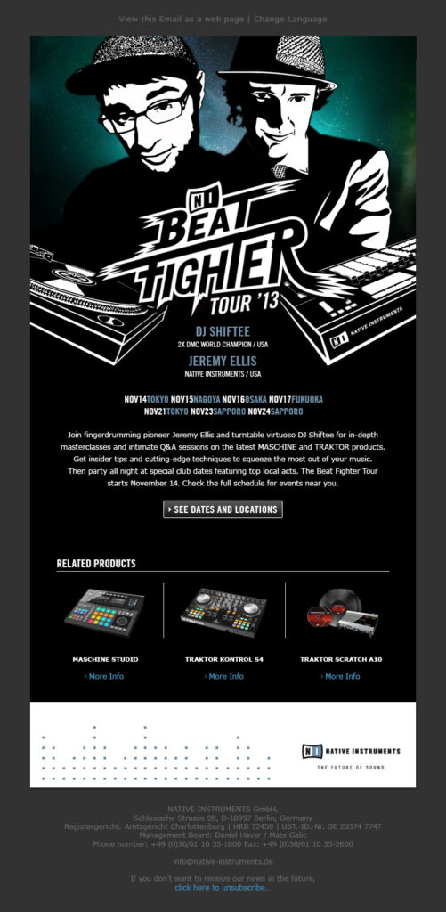
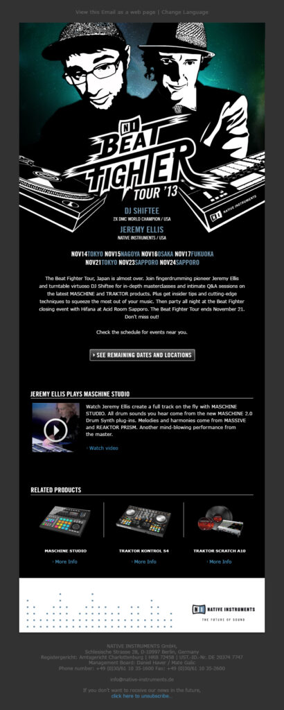
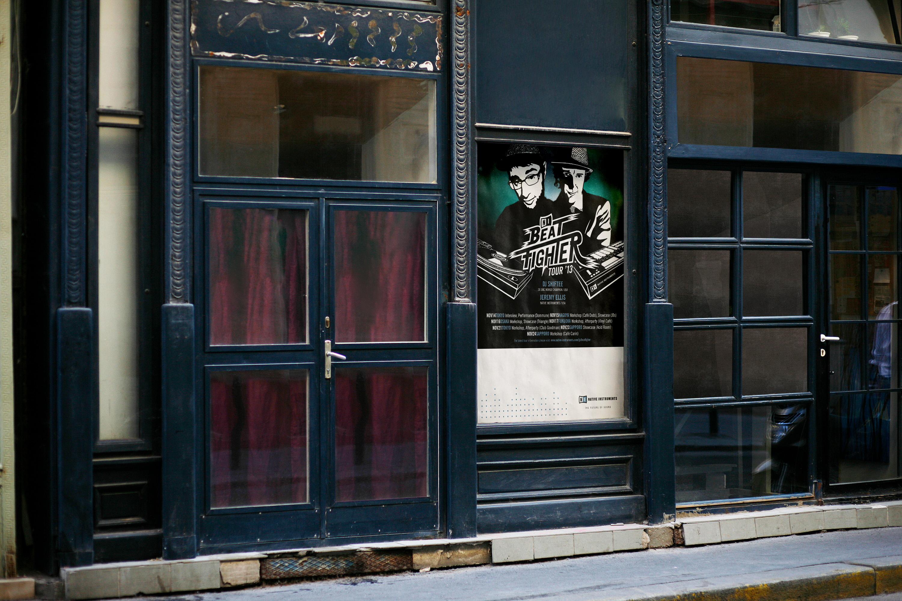
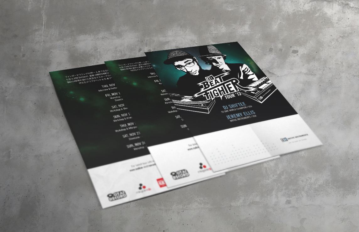
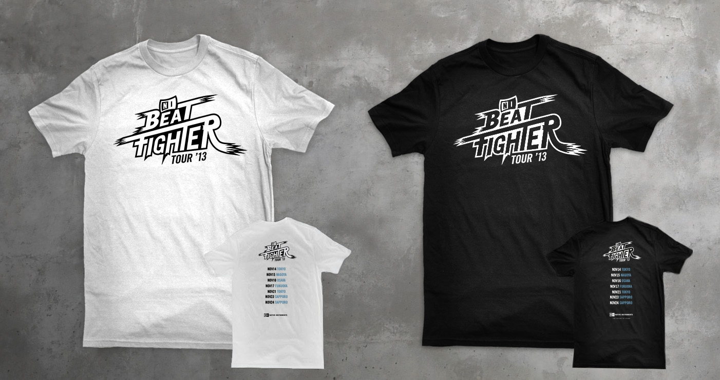
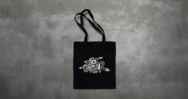
The Native Instruments Beatfighter Tour was a live roadshow in late 2013 that brought cutting-edge hardware and software integration directly to audiences in Japan.
Featuring artists like DJ Shiftee and Jeremy Ellis, the tour showcased the creative potential of Native Instruments gear, particularly the Maschine production system through dynamic live performances across techno, dubstep, and breakbeat genres.
I was responsible for the full campaign, designing all assets from concept to delivery. This included the event logo and key visual, as well as online (newsletter, landing page, social media) and print (poster, merchandise) materials.