Artist branding for Hong-Kong based DJ and electronic music producer INK ELEMENT, including logo design,and the development of the brand’s color palette and typographic system.
Miscommunication creates a gap between who we are and who we want to be. INK ELEMENT picks up the concepts of this dualism and miscommunication between humans. With his music he aims to provide a safe space for people to listen, reflect and become a more authentic version of themselves.
CLIENT
INK ELEMENT
SCOPE
logo design, color palette, typography
CONCEPTS
(mis-)communication, dualism, authenticity
LOGO DESIGN
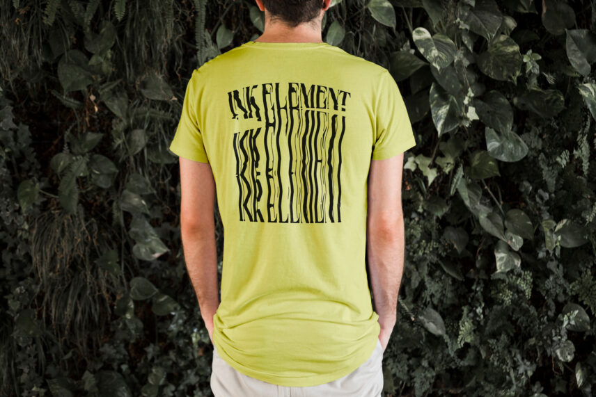
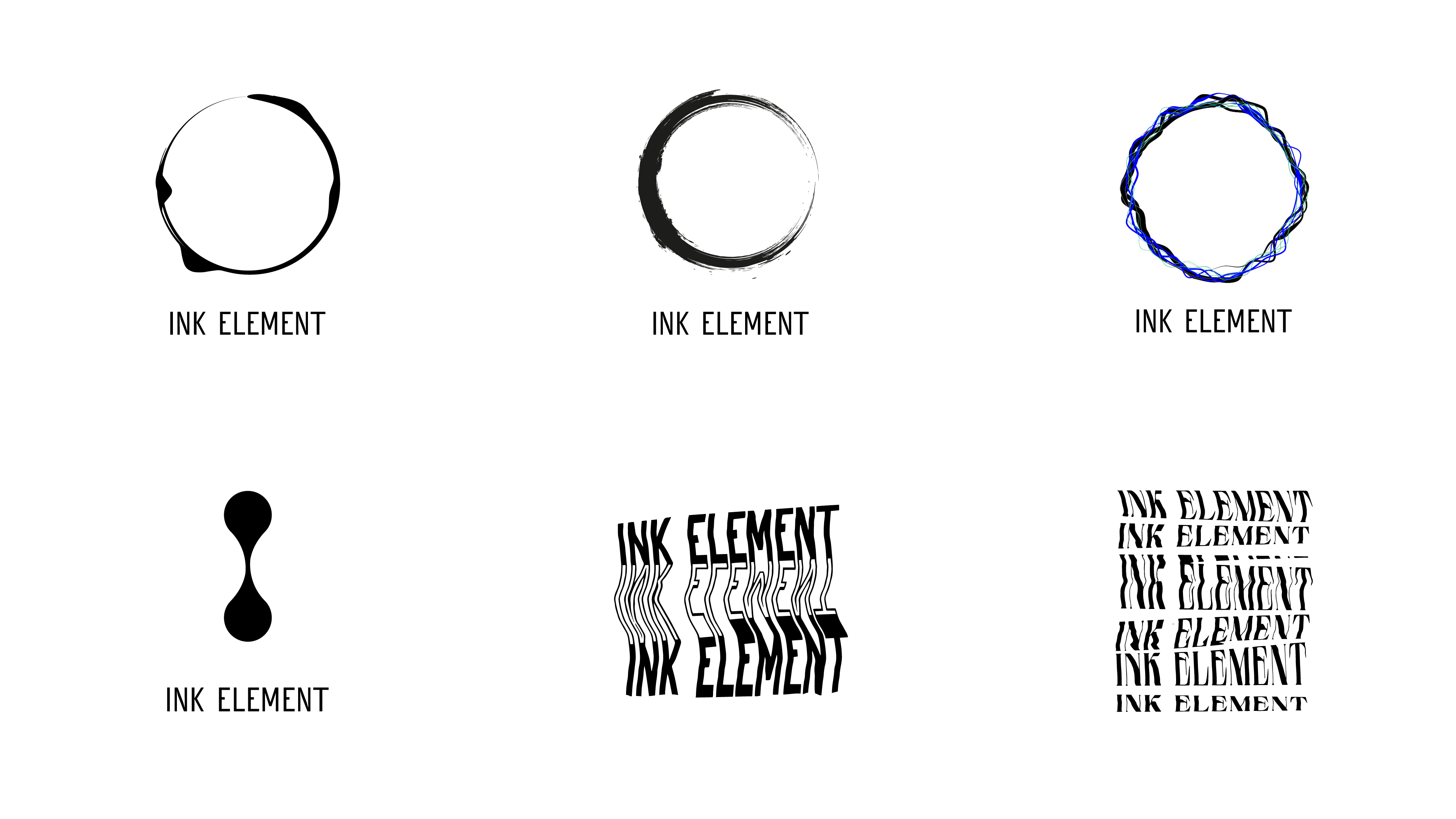
The core logo was created using a kinetic scanography technique, a visual metaphor for the gap between expression and perception. This organic, chaotic effect is intentionally framed within a clean, ordered square—representing the clarity and structure that can emerge from introspection.
COLOR PALETTE + TYPOGRAPHIC SYSTEM The brand typography, color palette, and overall system reinforce the artist’s values of creativity and authenticity, creating a bold and coherent brand that invites reflection.
Early logo drafts drew inspiration from Denis Villeneuve’s Arrival—a film about the transformative power of language and communication. To keep the human hand visible in the process, I experimented with analog techniques: watercolor, Rorschach folds, and kinetic scanography. The distortion technique also served as a visual metaphor for miscommunication, capturing the gap between expression and perception. The process became part of the concept.