Close
Type at least 1 character to search
Back to top

ELEDA

ELEDA is a Berlin-based duo that creates music and immersive experiences to inspire, empower, and invigorate their audience. Their diverse backgrounds and passion for cutting edge technology set the tone for their work. The challenge of this project was to build a bridge between the eccentric, cinematic, bold and yet ethereal and elegant aspects of the ELEDA brand. 
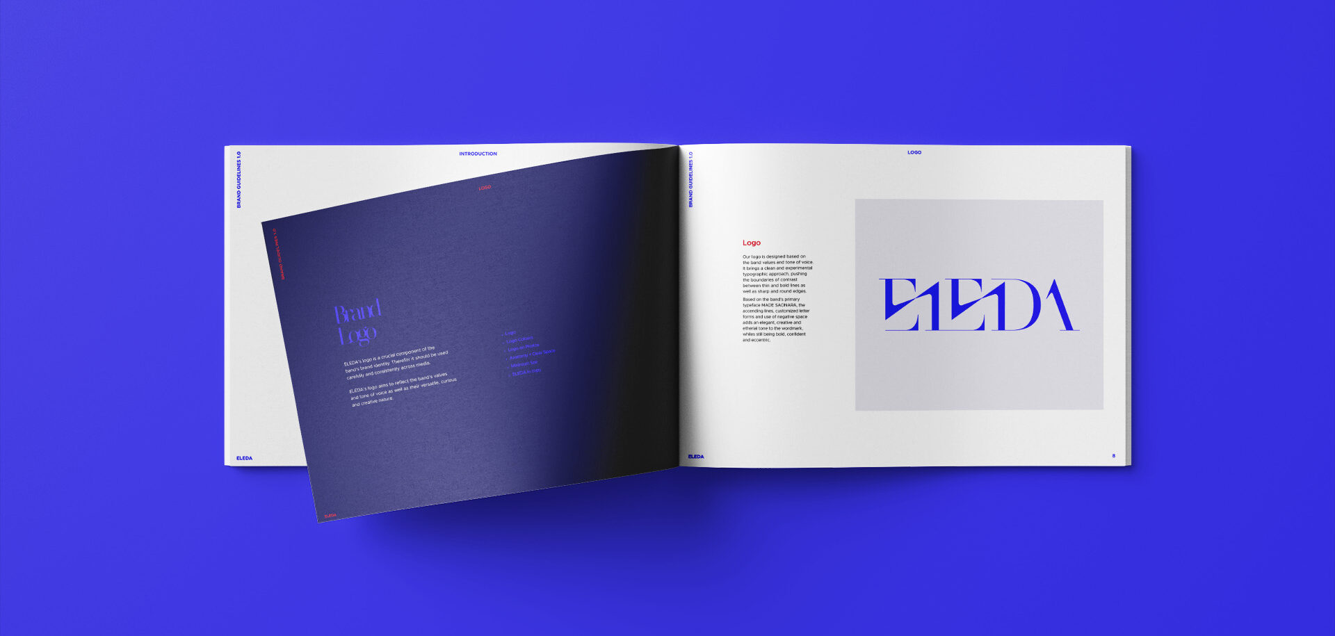
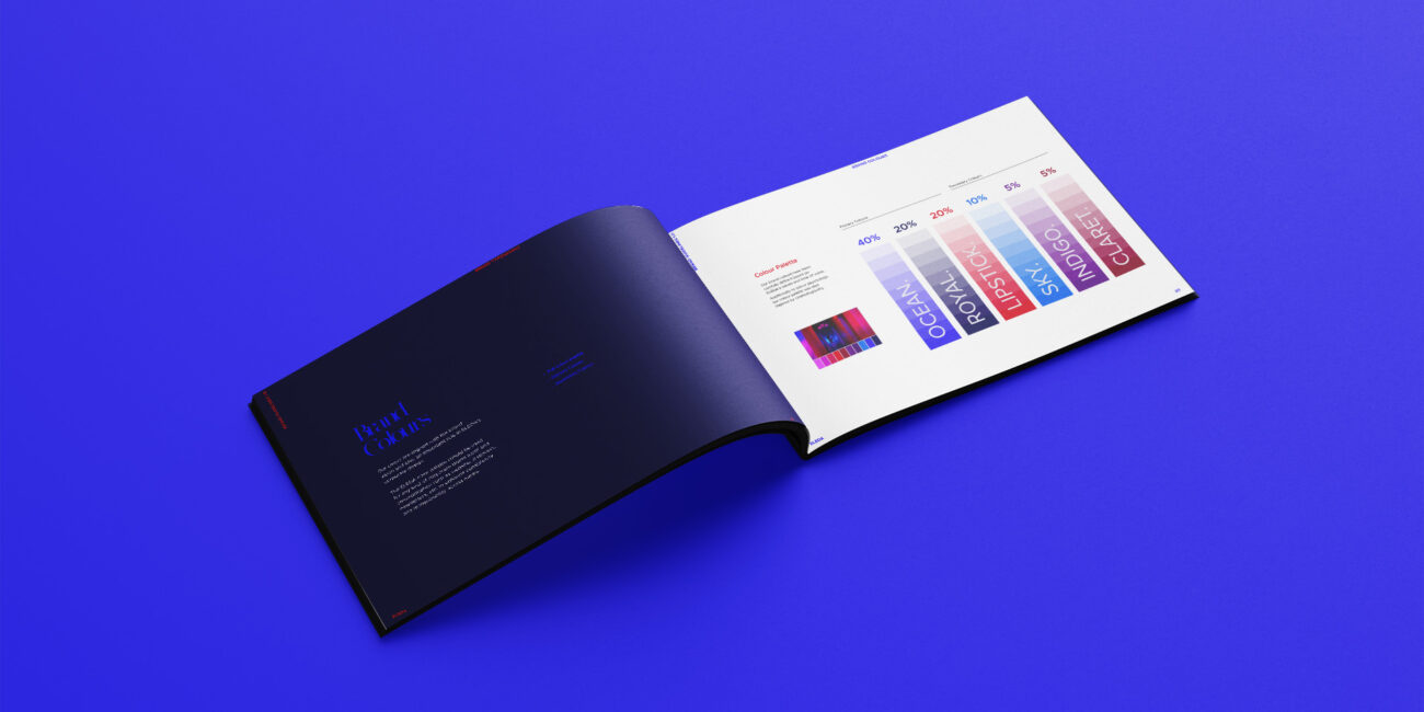
ELEDA corporate design manual by Yvonne Hartmann

Design apProach

CLIENT

ELEDA

SCOPE

art direction, logo design, color palette, typography, press photos

TONE OF VOICE

eccentric, cinematic, bold, ethereal

LOGO

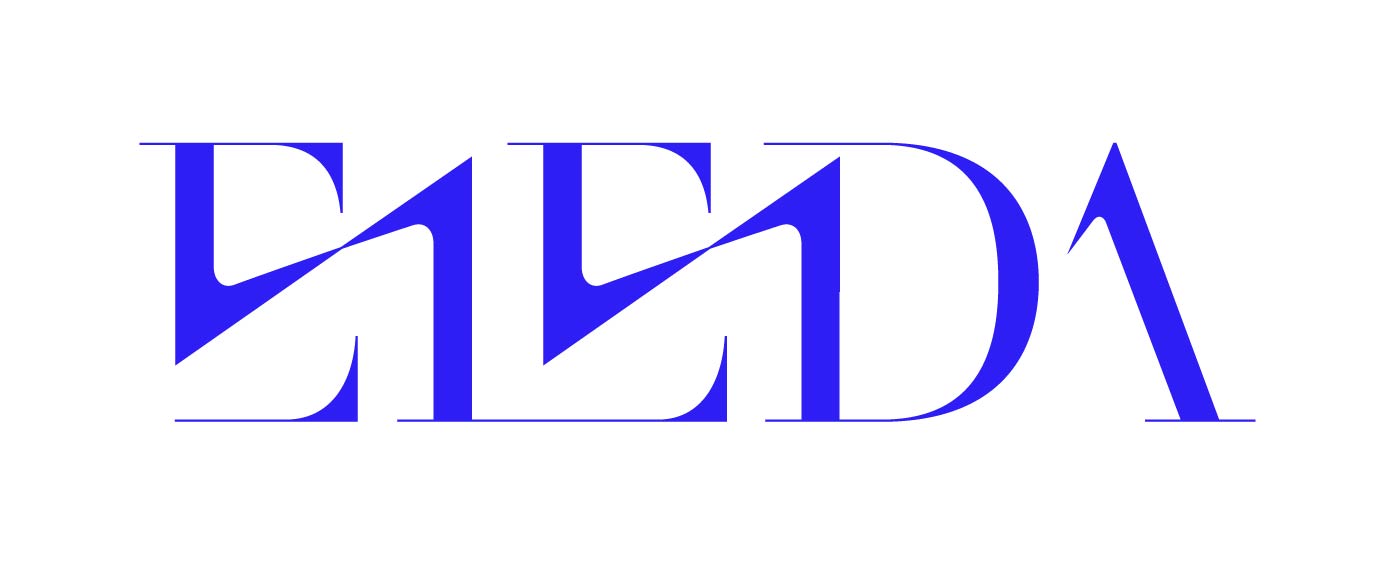
The ELEDA logo brings a clean and experimental typographic approach, pushing the boundaries of contrast between thin and bold lines as well as sharp and round edges. Based on the band’s primary typeface MADE SAONARA, the ascending lines, customized letter forms and use of negative space adds an elegant, creative and etherial tone to the wordmark, while still being bold, confident and eccentric.

ELEDA logo design by Yvonne Hartmann

COLOURS + TYPE

The brand colour palette has been carefully defined based on ELEDA’s values and tone of voice and reflects the diversity of the ELEDA sound. Additionally to colour psychology, the colour palette was also highly inspired by cinematography.

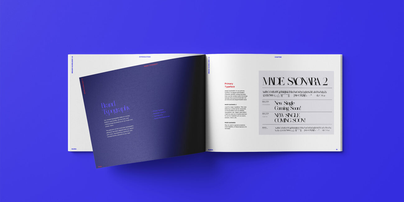
With Made Saonara 2 and  Metropolis the brand typography builds an elegant and timeless bridge between the eccentric/cinematic but yet ethereal ELEDA style.

PRESS PHOTOS

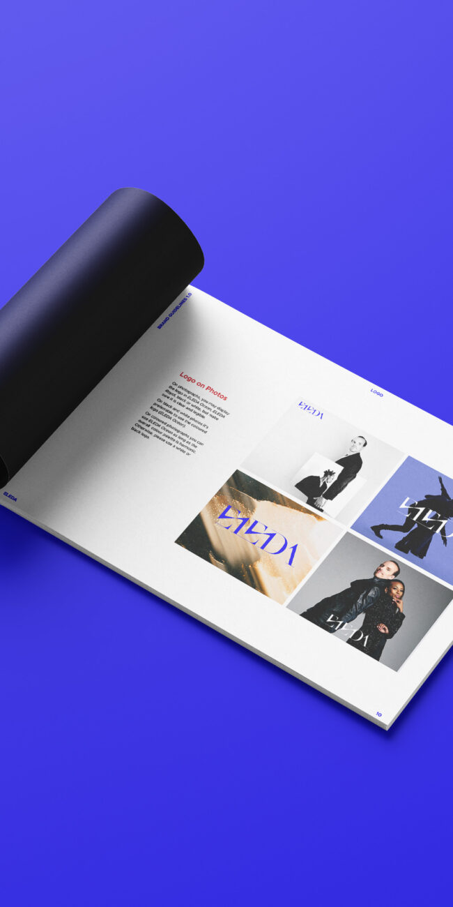
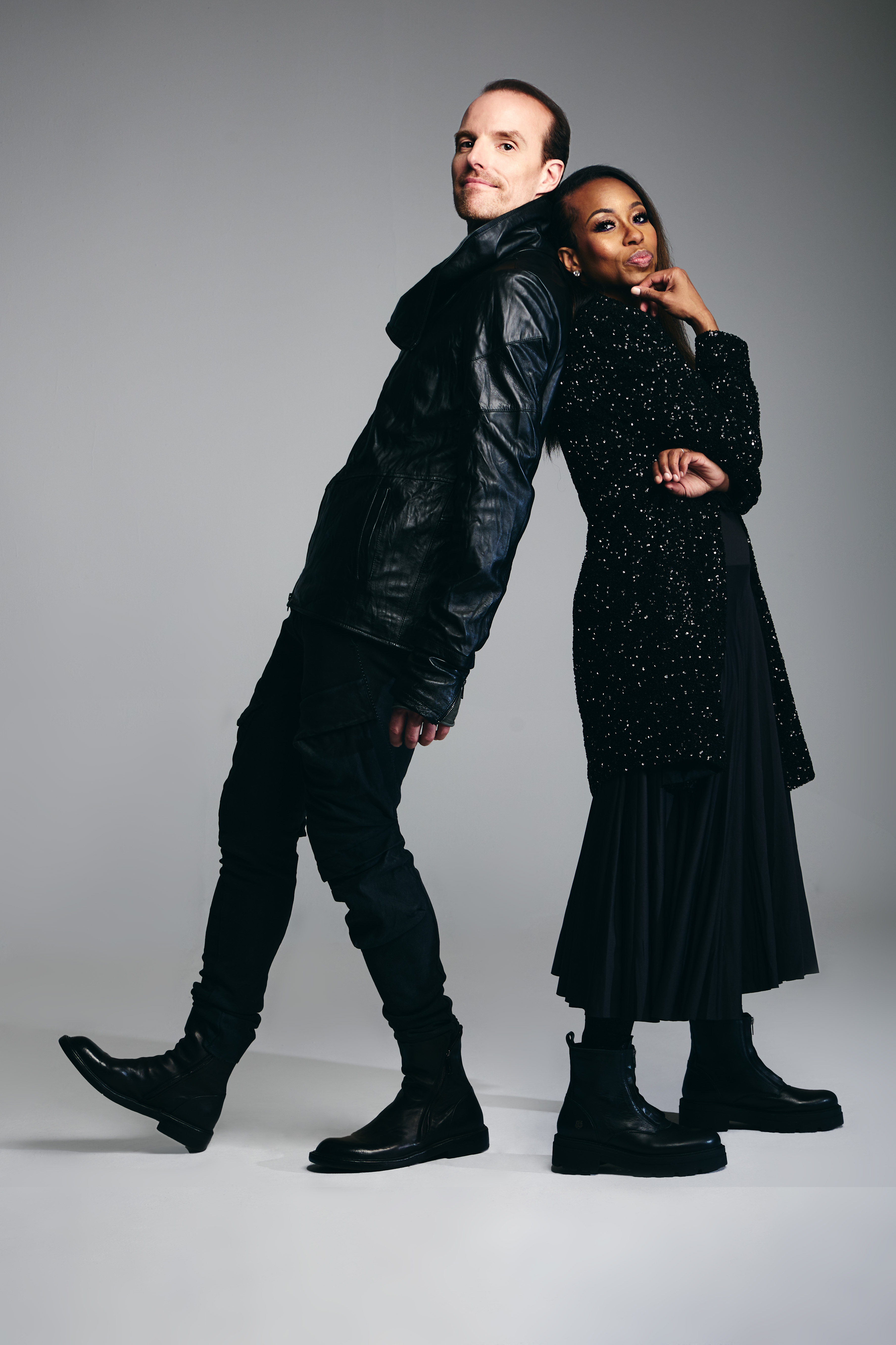
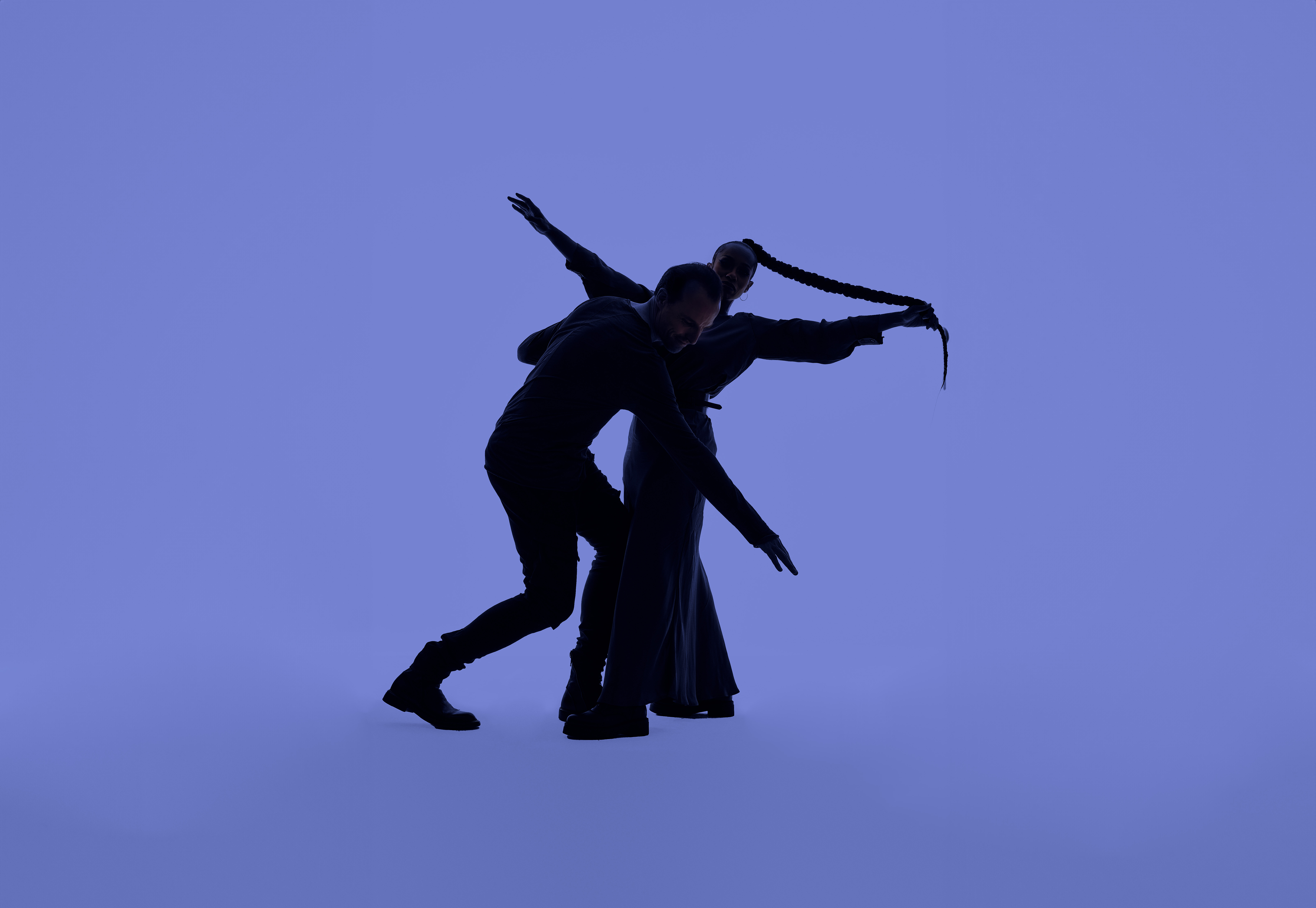
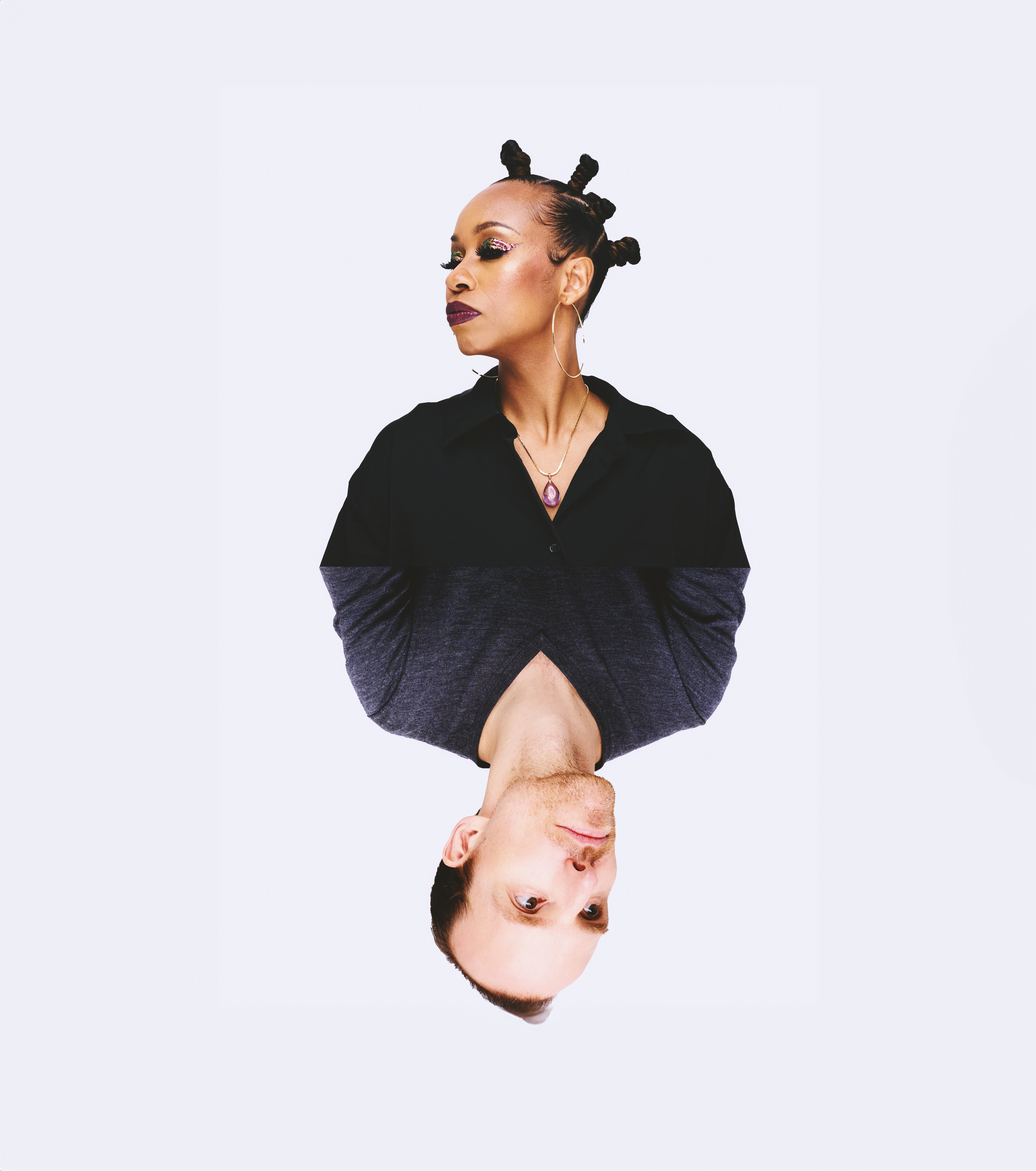
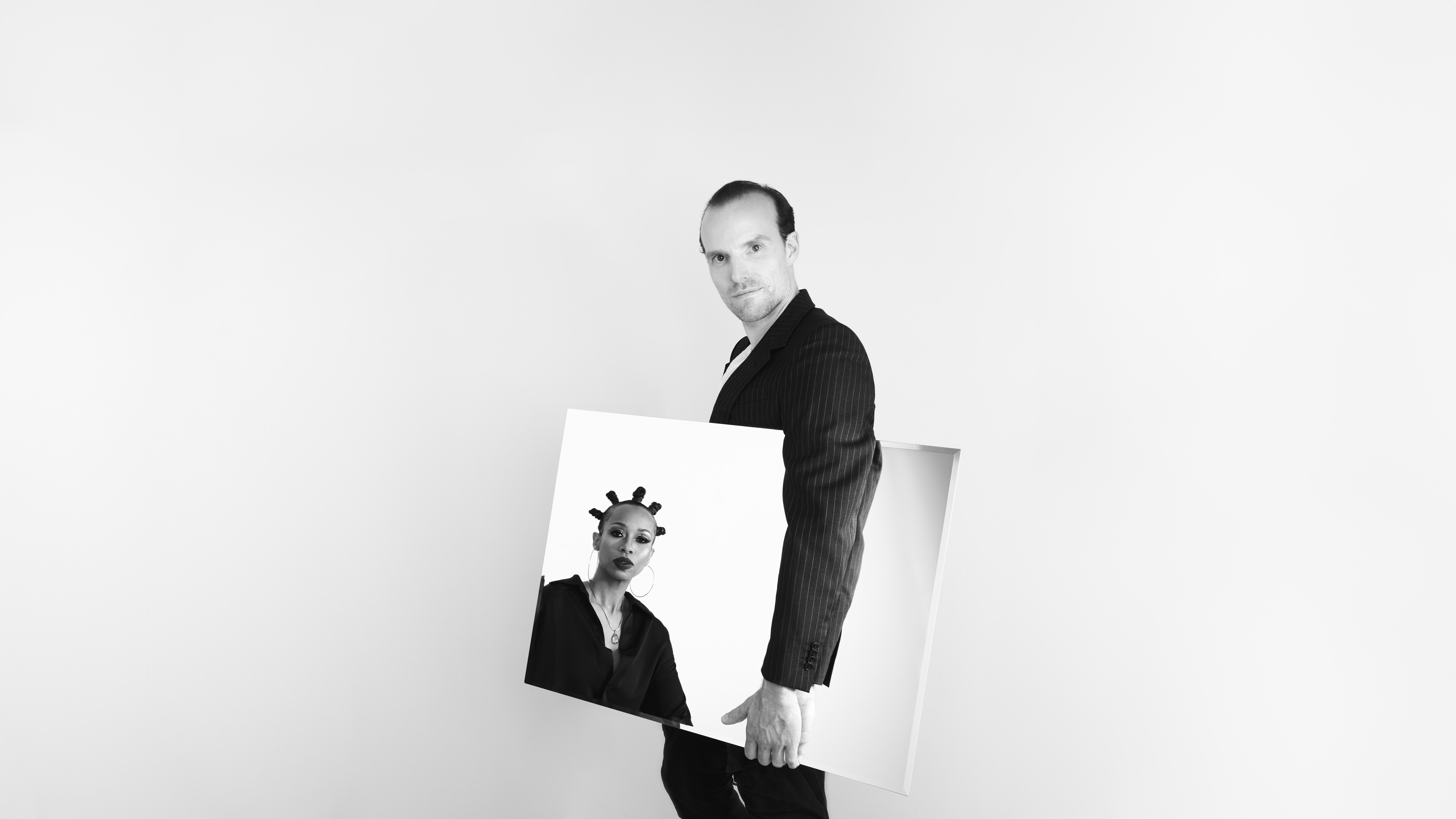
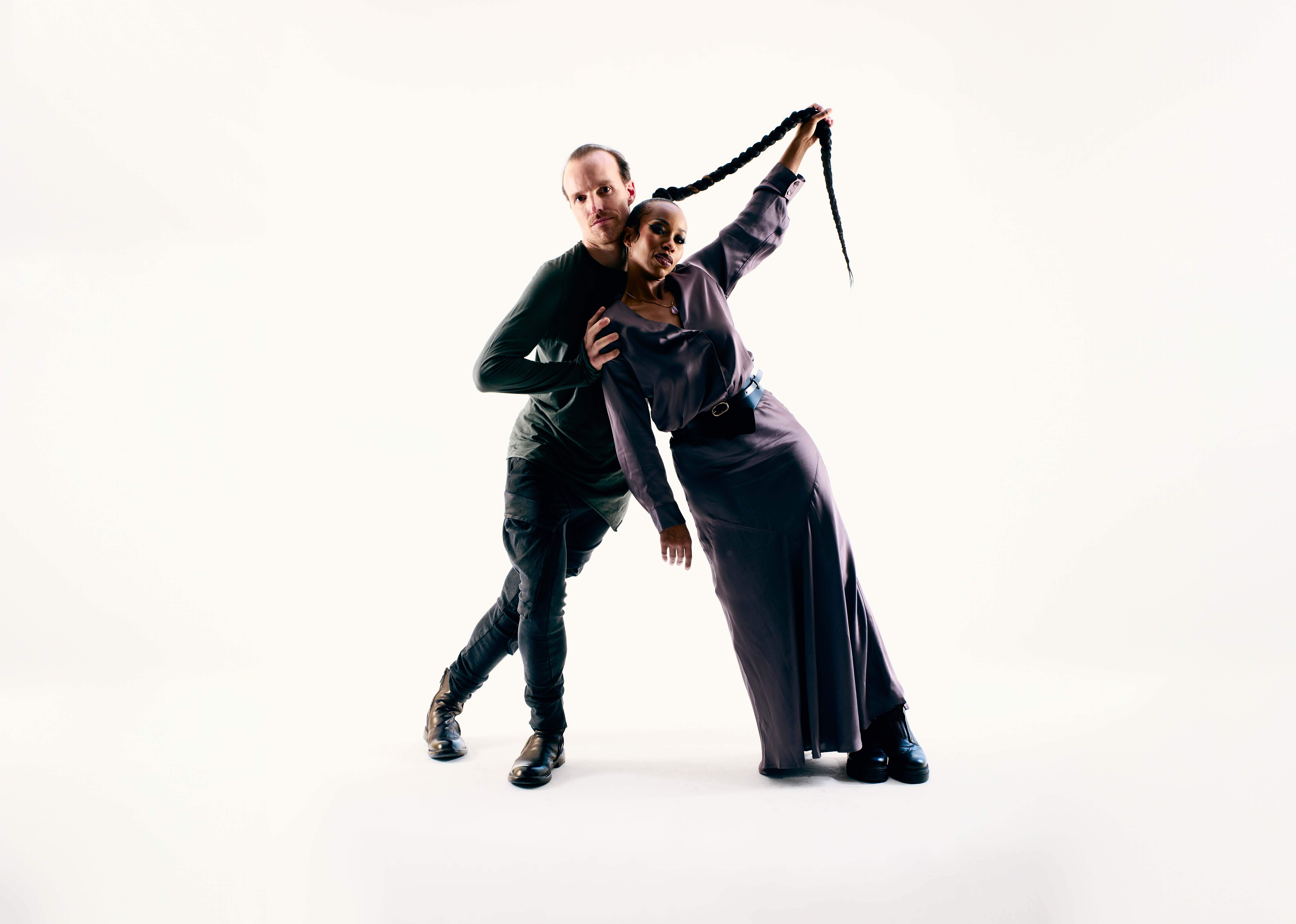
ELEDA’s tone of voice was translated into clean and elegant, yet bold and expressive press shots with the strategic use of negative space, eccentric poses, experimental props and style.